CLIENT
Servier
CONTRIBUTION
Design System
Lead UX/UI Design
Design to Scale, with a single source of truth.
This was one of the first design systems that I documented and built, during the end-to-end design of a CRM, deployed in over 140 countries.
Discrepancies began to creep in during development and tests, It became important to industrialize the process and establish consistency with reusable CSS and Code snippets for the development team to rapidly scale and build without sacrificing the user experience, which could also lead to errors in data entry and reporting.
The requirements were based on two operating systems, iOS and Windows, with three breakpoints: iPad (salesforce), laptop, and Windows desktop ( admin/super-admin). At the time Material Design was the most complete documentation in UI components and patterns, which I based the CRM design documentation upon and with some input from iOS human guidelines.
The aim was platform parity, which would inform the use of components and states appearing the same in both environments.
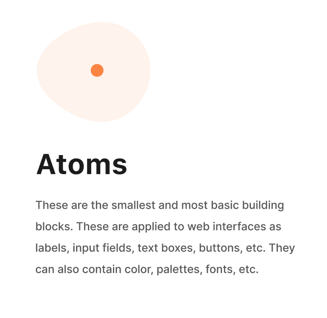
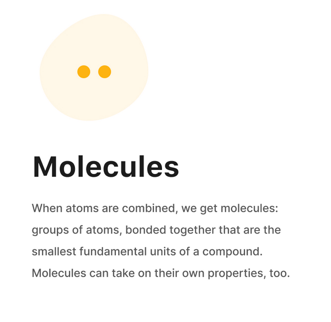
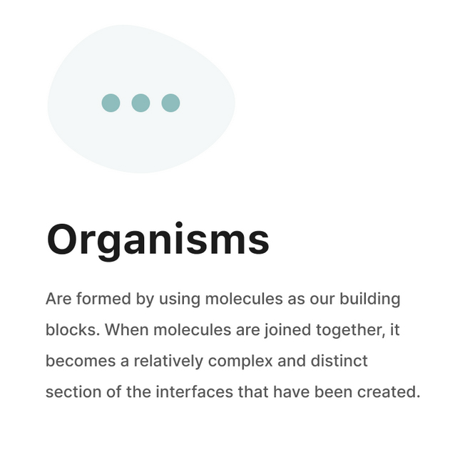
Based on Brad Frost's Atomic design system the design system was fleshed out.
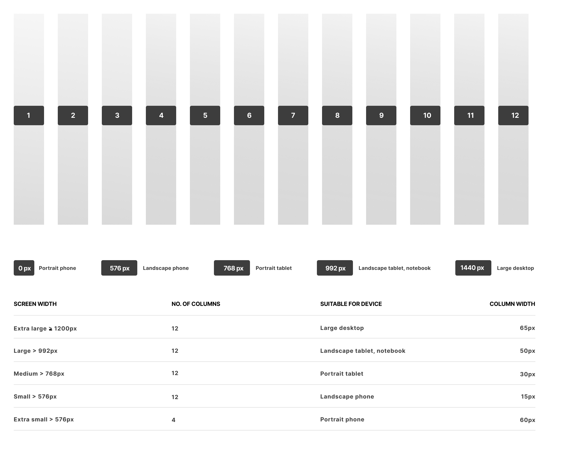
Setting up the breakpoints and grid
For the responsive requirements the system was based on the bootstrap 12-column system to set up the UI patterns for content and navigation layouts. Utilizing a 4px grid system and a 12-column layout, creating a flexible environment to structure all of the content. The column grid system distributes the content correctly.
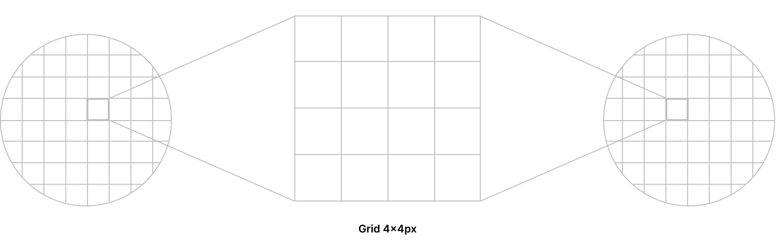
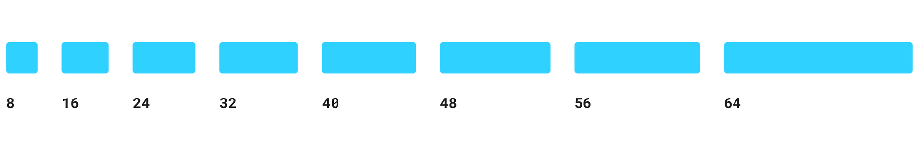
A 4 pt grid for granularity
Optimized for 1.5x resolution devices, on an 8-pixel grid, button and icon placement, forms, tables, and UI patterns worked well. Yet the 4-pixel grid works well with granular detail for type, padding, and margins. The 4-point grid gives us more flexibility, accuracy, precision, and detail regarding the spacing ensuring pixel perfect designs
Colour system
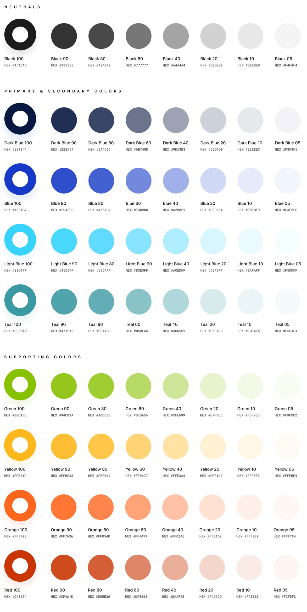
The colours selected are designed to be harmonious, ensure accessibility, and distinguish interface elements and components from one another. Colour is also used to add meaning and support design communication.
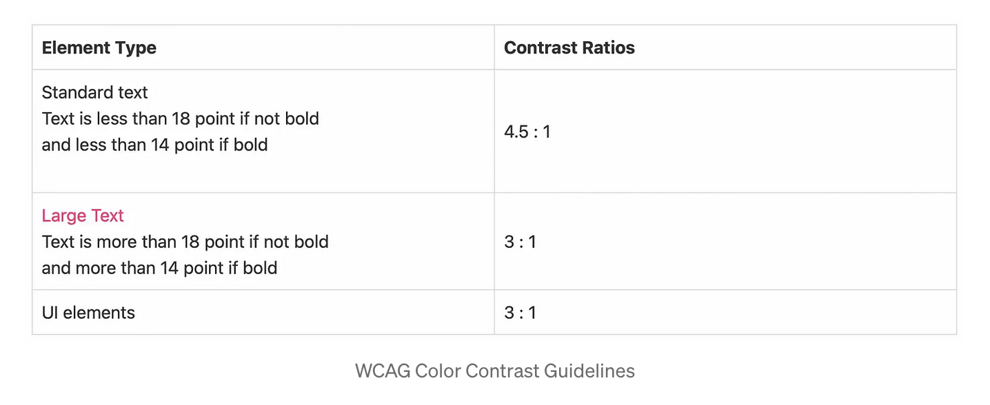
Color identification was important for the brand and UI application to meet accessibility standards and align with WCAG color contrast recommendations for contrast and hierarchy. It was important to keep the colors minimal as more options = more cognitive load=more maintenance.
Extended palettes of the base color were established to allow variations and contrast adjustments across different devices and usages (I like to use ColorBox for creating extended color patterns and specifying hue and saturation). Usage guidelines were defined by assigning colors to global UI elements such as background, text, and containers. Establish naming conventions — to ensure all stakeholders communicate in a coherent language and not hardcoded hex codes
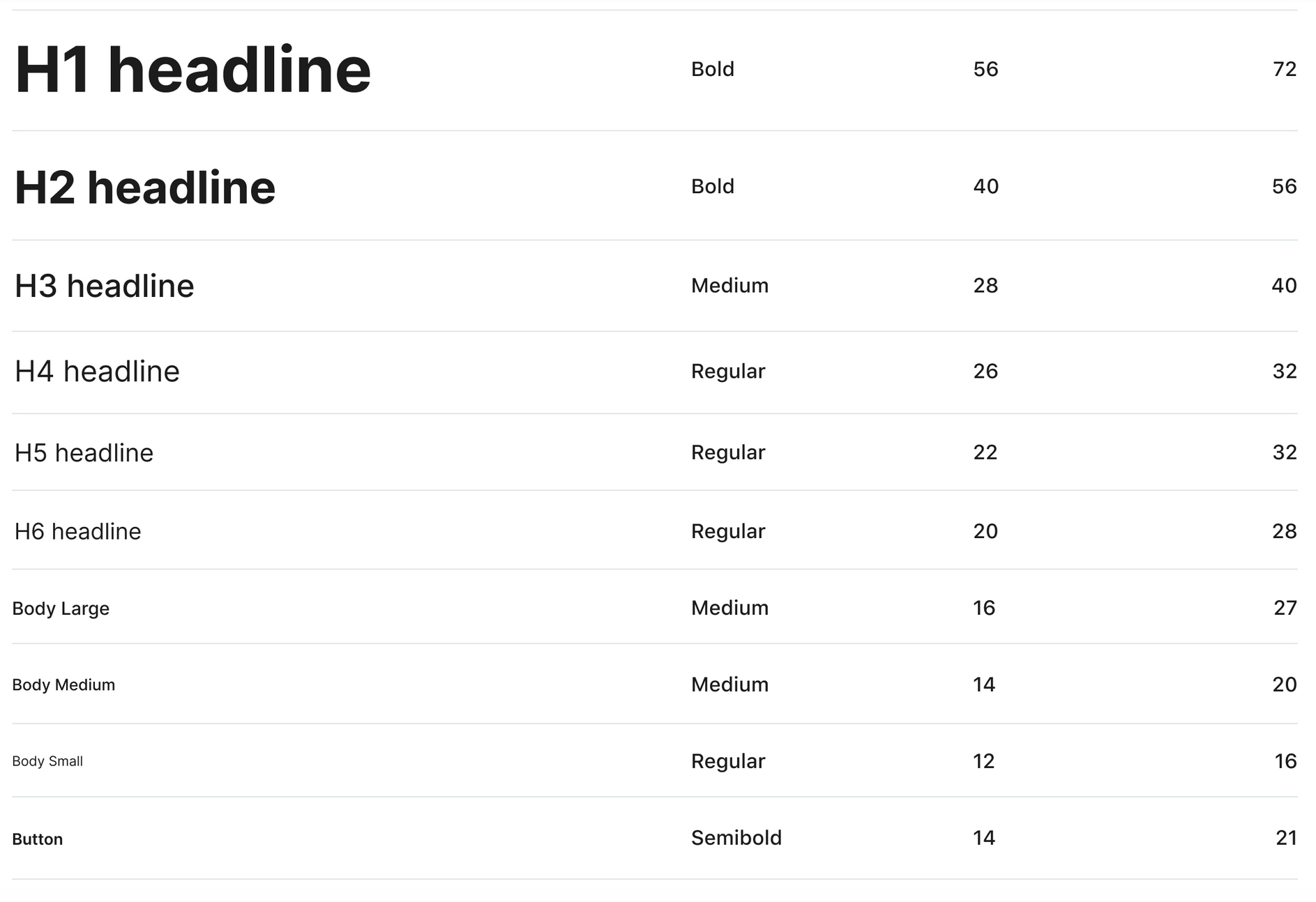
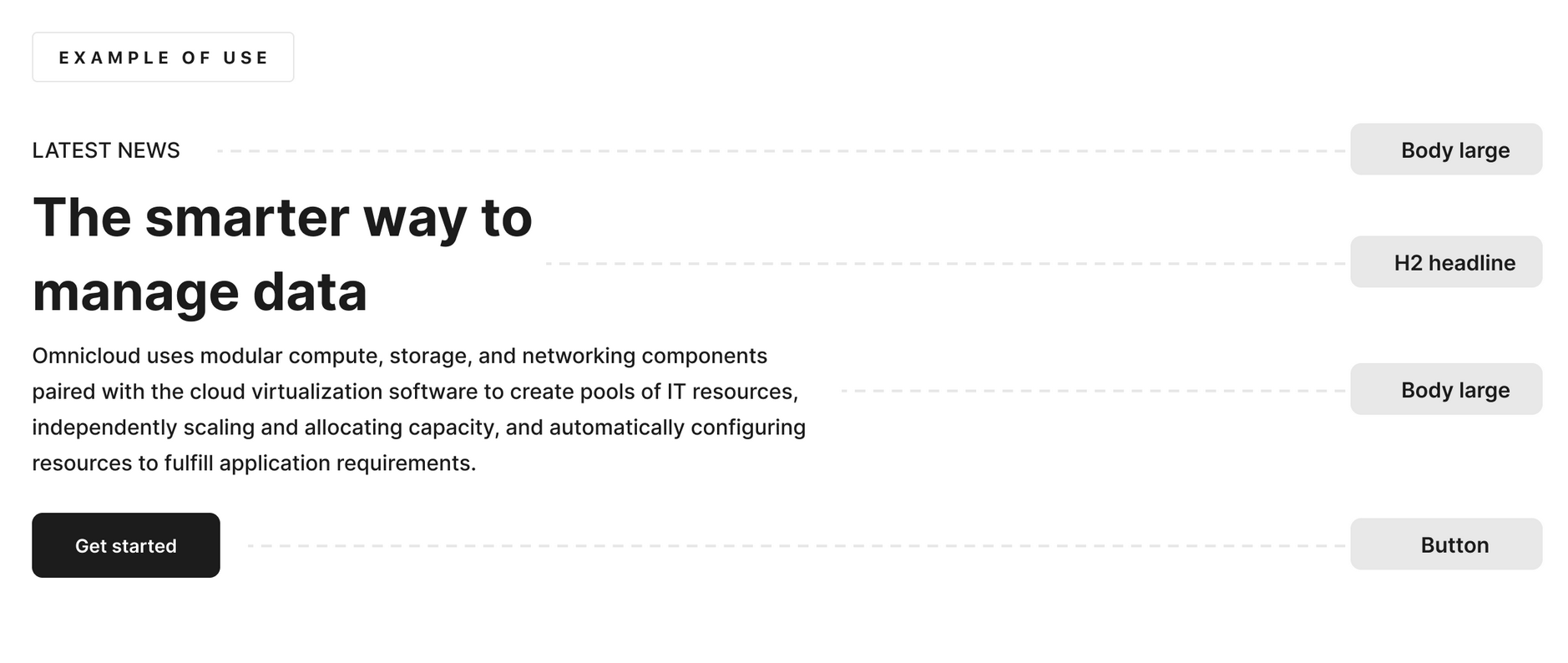
Typography
Typographic scale which typefaces will become a standard but also how we organise a consistent hierarchy which is going to build a predictable information architecture across the product. Roboto, was chosen for the CRM for it's legibility and versatility.
To establish a type scale, I often use this tool, Typescale or Google Fonts Type Scale Generator to set up systems for typographical use.
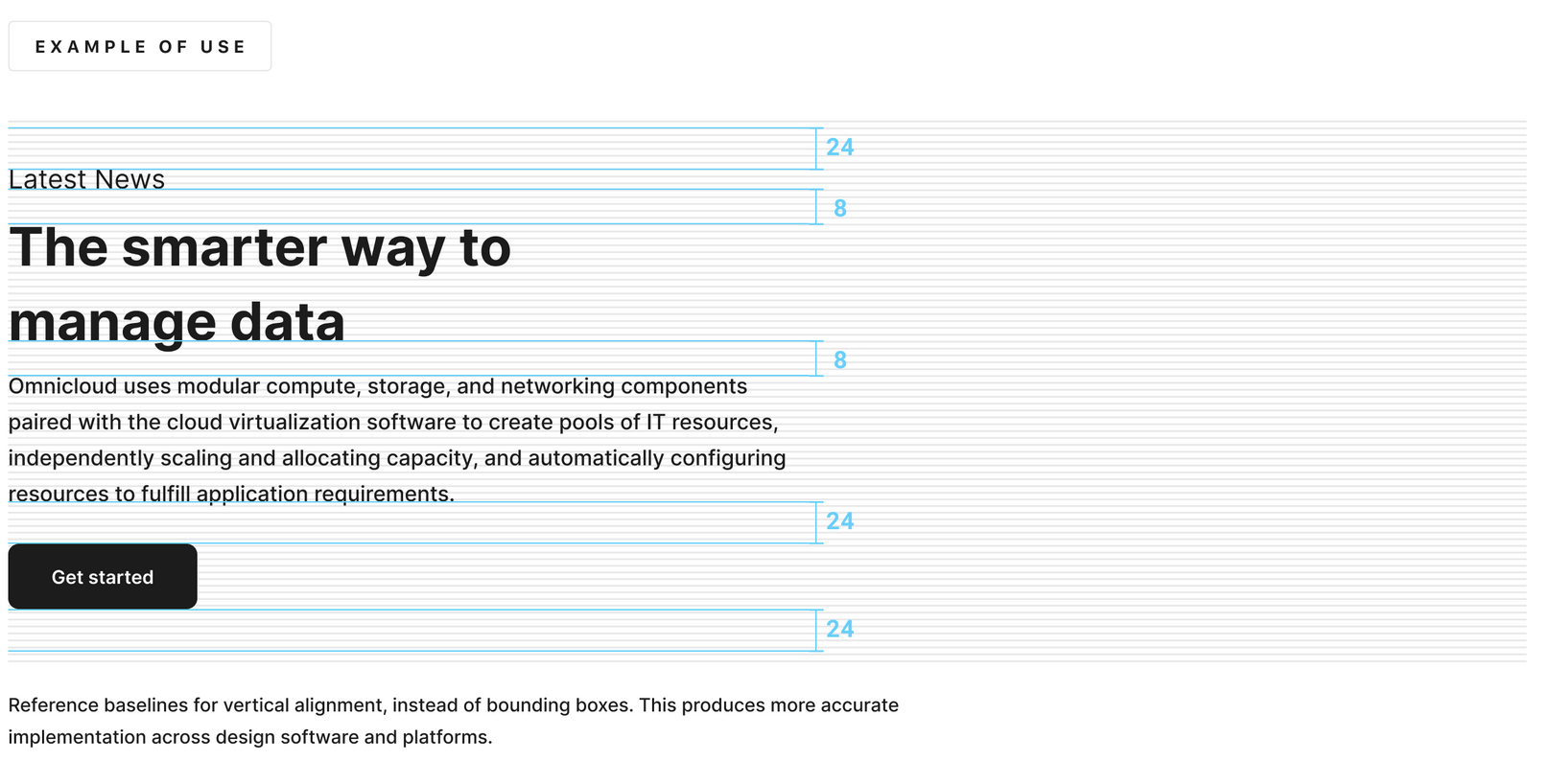
Titles and headlines emphasize expression, and for the body copy and marginal text or smaller fonts, the focus is on readability. Headlines and titles are compact in line height.
Indentation
For indentation guided by the square grid, I used 8 pixels initially and then reduced it -down to fours pixels for more granular detail. Most measurements aligned to the 8px grid to maintain consistency and hierarchy in the information displayed.
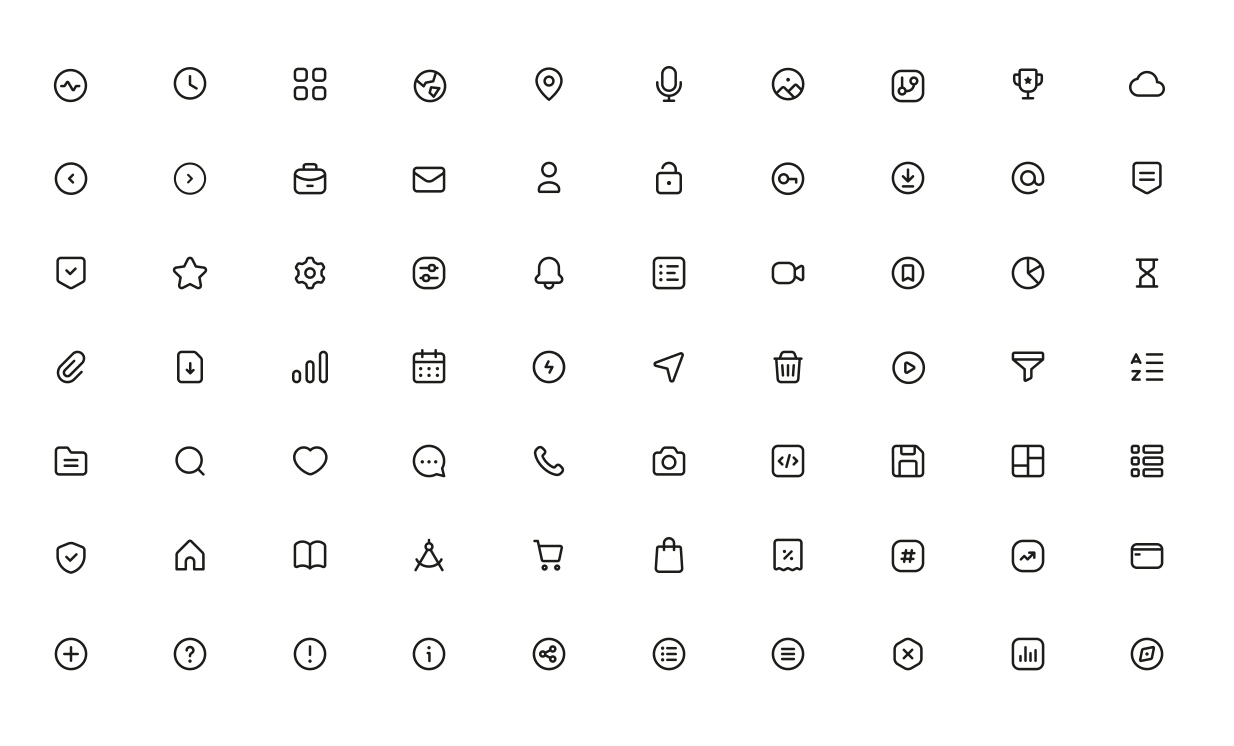
Icons
Creating the icon family required a thoughtful approach and several iterations for the set to be well organized, well-documented, and tested in context. To achieve harmony the icons needed to be consistent with a 1.5 pixel centered stroke and 24 x 24 px icon size. Pairing a button label with an icon reinforces meaning and quickens recognition.
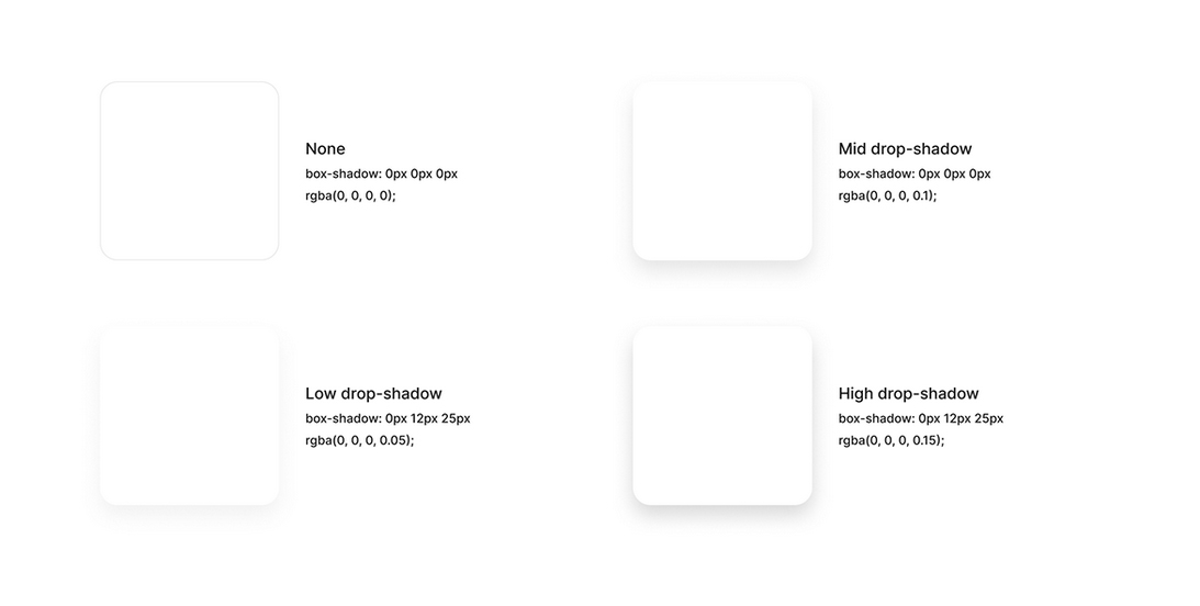
Box shadows & elevation
Elevation is a design technique that utilizes shadows and visual layering to create a sense of depth and hierarchy between user interface (UI) elements. Allow surfaces to move in front of and behind other surfaces, such as content scrolling behind app bars. Focus attention on the highest elevation, such as a dialog temporarily appearing in front of different surfaces.
By suggesting which elements are above others, it helps distinguish components like floating action buttons or elevated cards on the z-axis in 2D space by adjusting the shadow's intensity and distribution, which enhances the user experience by replicating real-world principles of light.
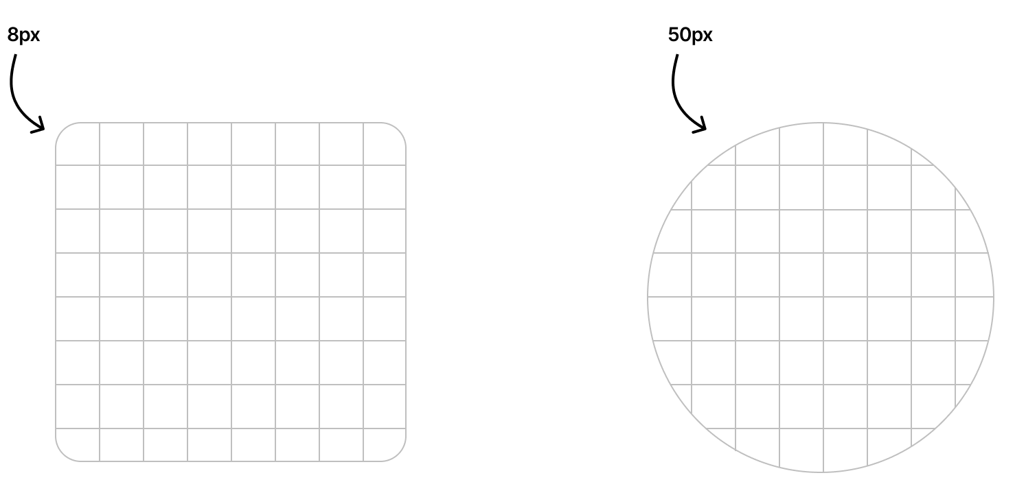
Border radius
Border radius is a design element that controls the roundness of an element's corners. It guides the user's focus and reflects brand identity. By adjusting the roundness of the corners, designers can create a more modern or traditional look and feel to their designs
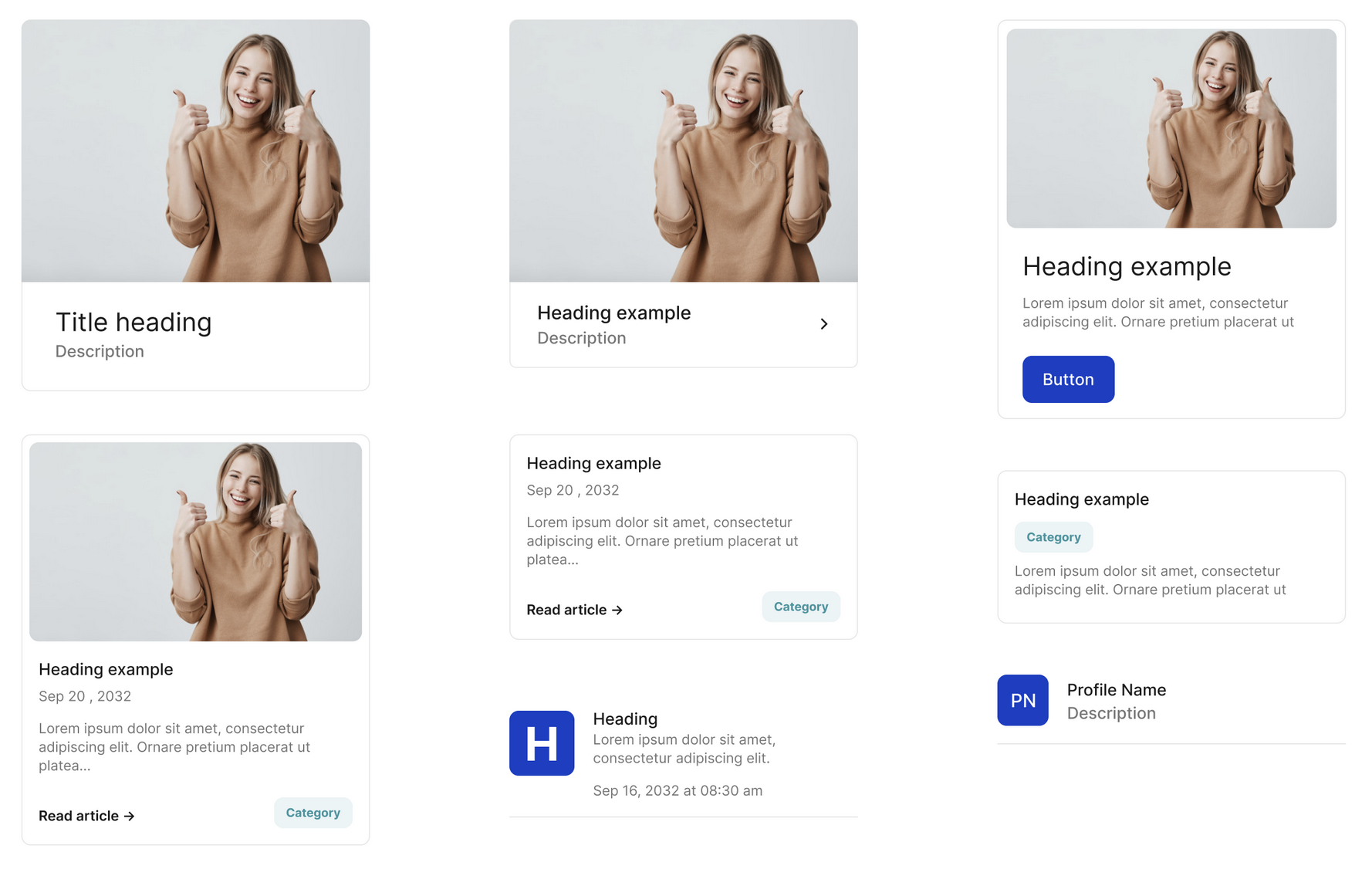
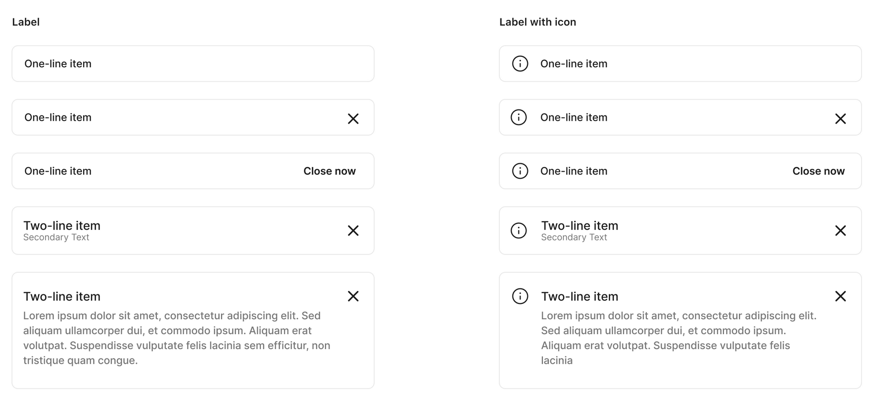
UI Components
Components are the reusable building blocks, each component meets a specific interaction or UI need, and has been specifically created to work together to create patterns and intuitive experiences. Other components that made up the design system were avatars, badges, chips, calendars, date pickers, dropdowns, dialogues, and drawers.
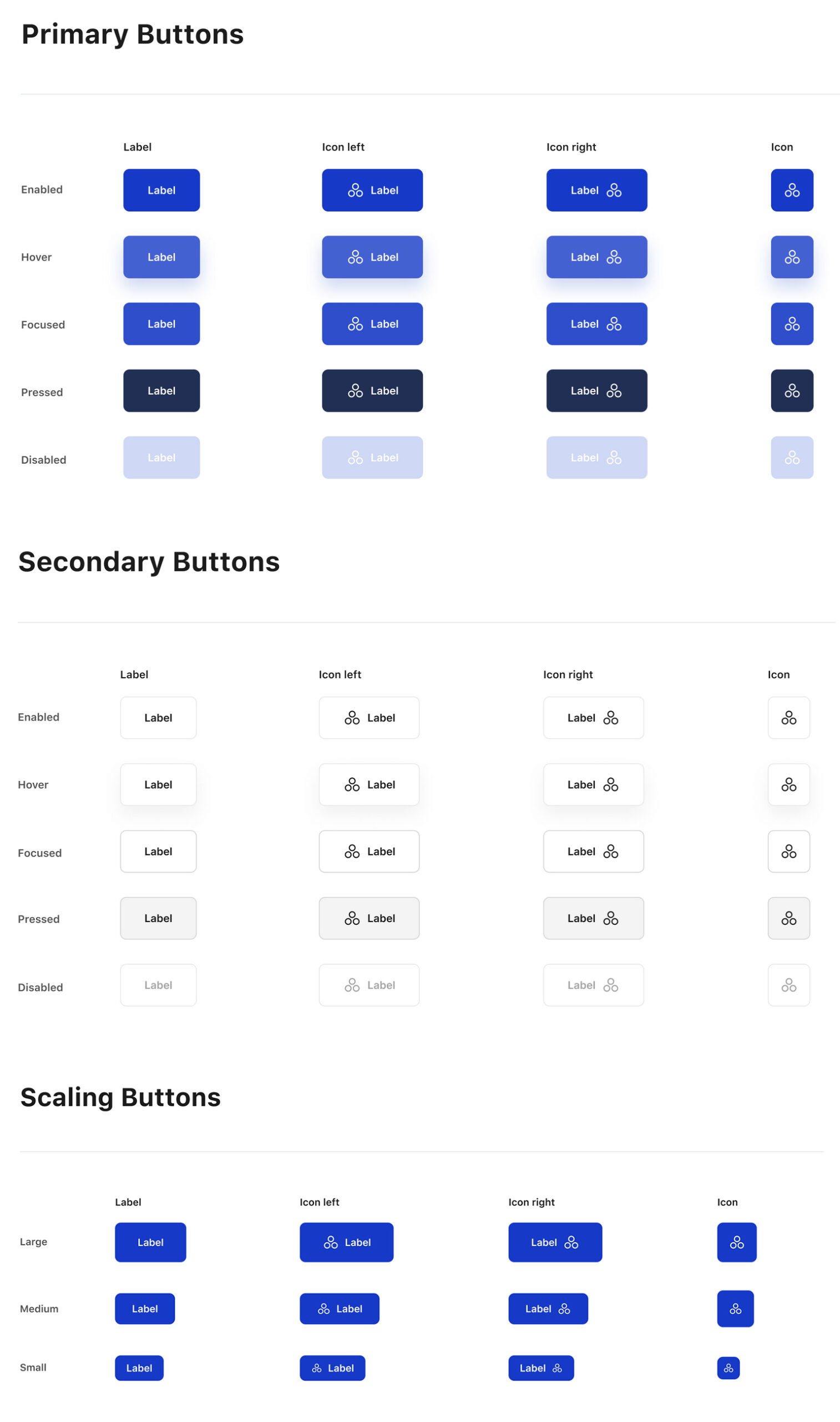
Buttons
It was important ensure consistency across the buttons as CTAs they were key to data entry and confirmation, during the documentation I could see that discrepancies were rapidly creeping in, regarding size, placement, paddings, margins, and even labels.
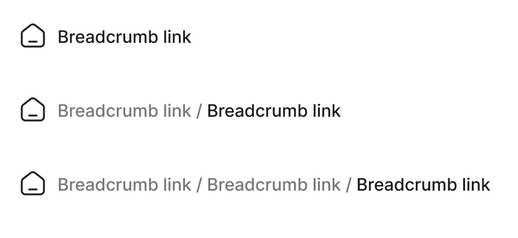
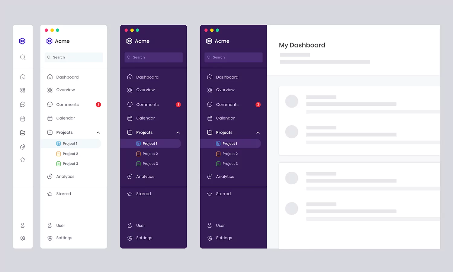
Navigation / Breadcrumbs
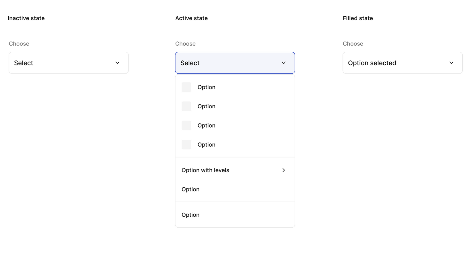
Navigation / Dropdown
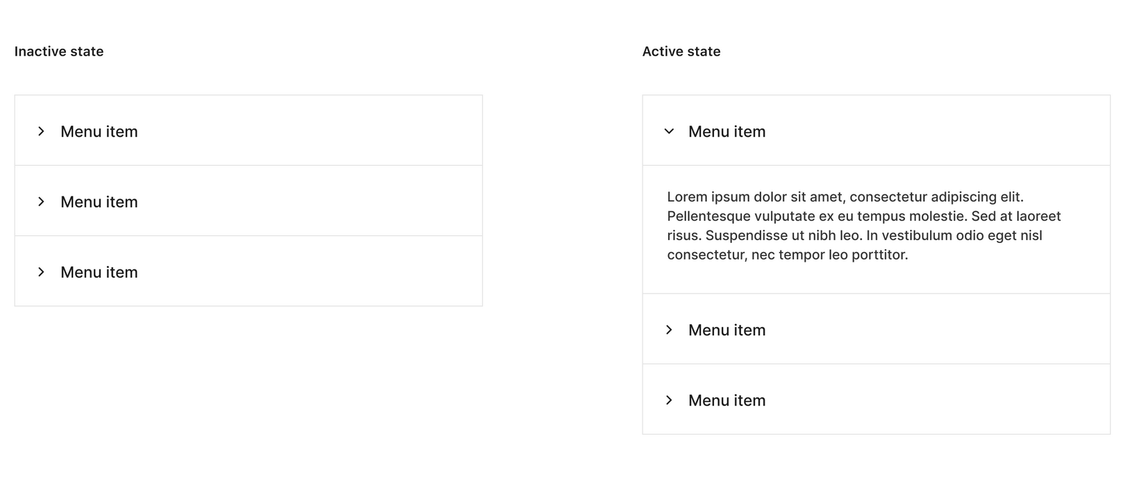
Navigation / Drawer
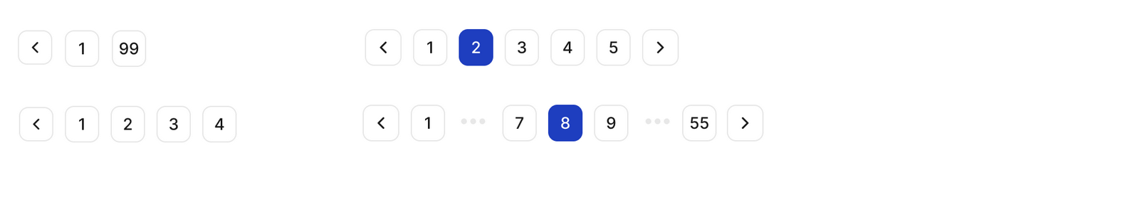
Navigation / Pagination
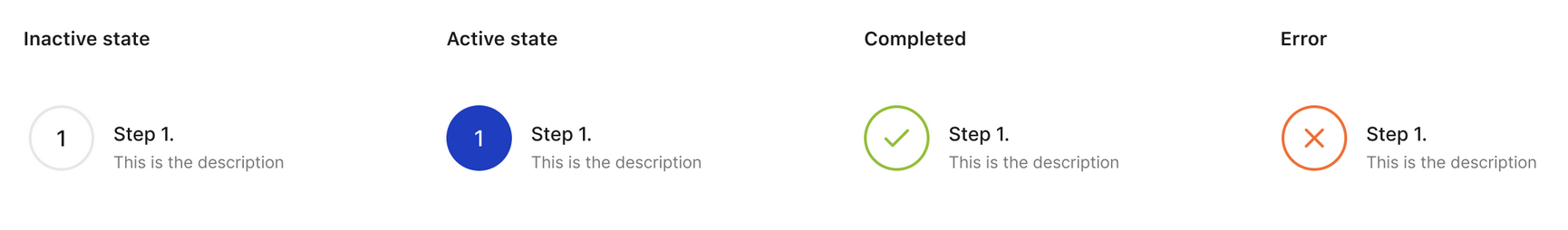
Navigation / Steps
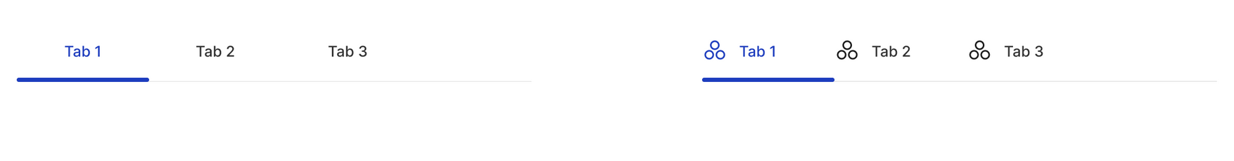
Navigation / Tabs
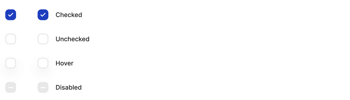
Data entry / Checkbox
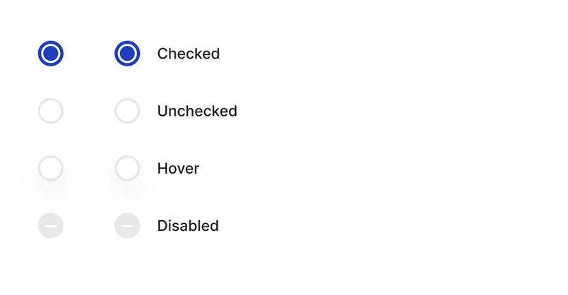
Data entry / Radio buttons
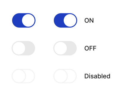
Data entry / Switches
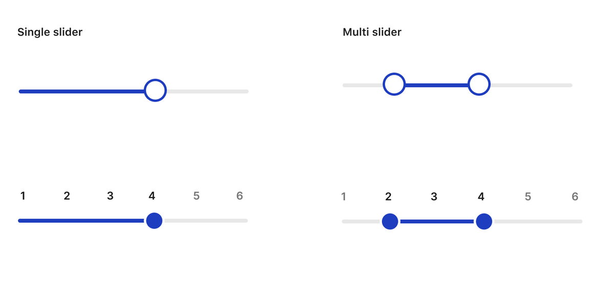
Data entry / Sliders
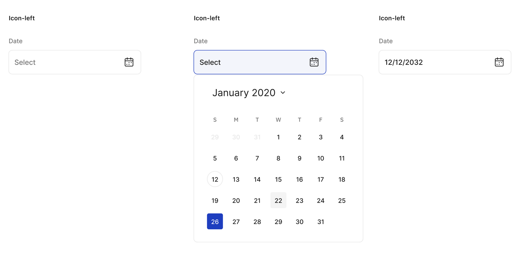
Data entry / Datepicker
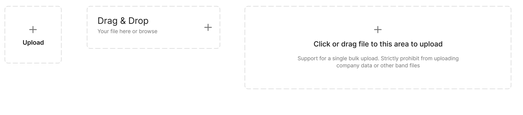
Data entry / Upload
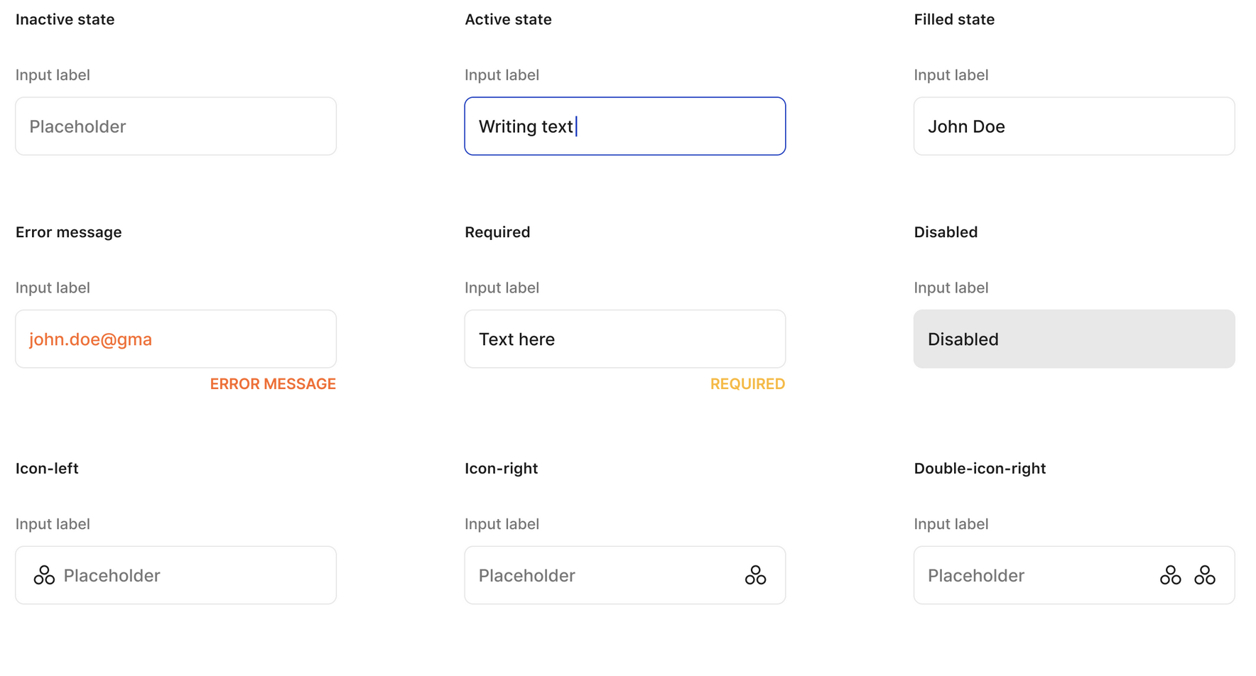
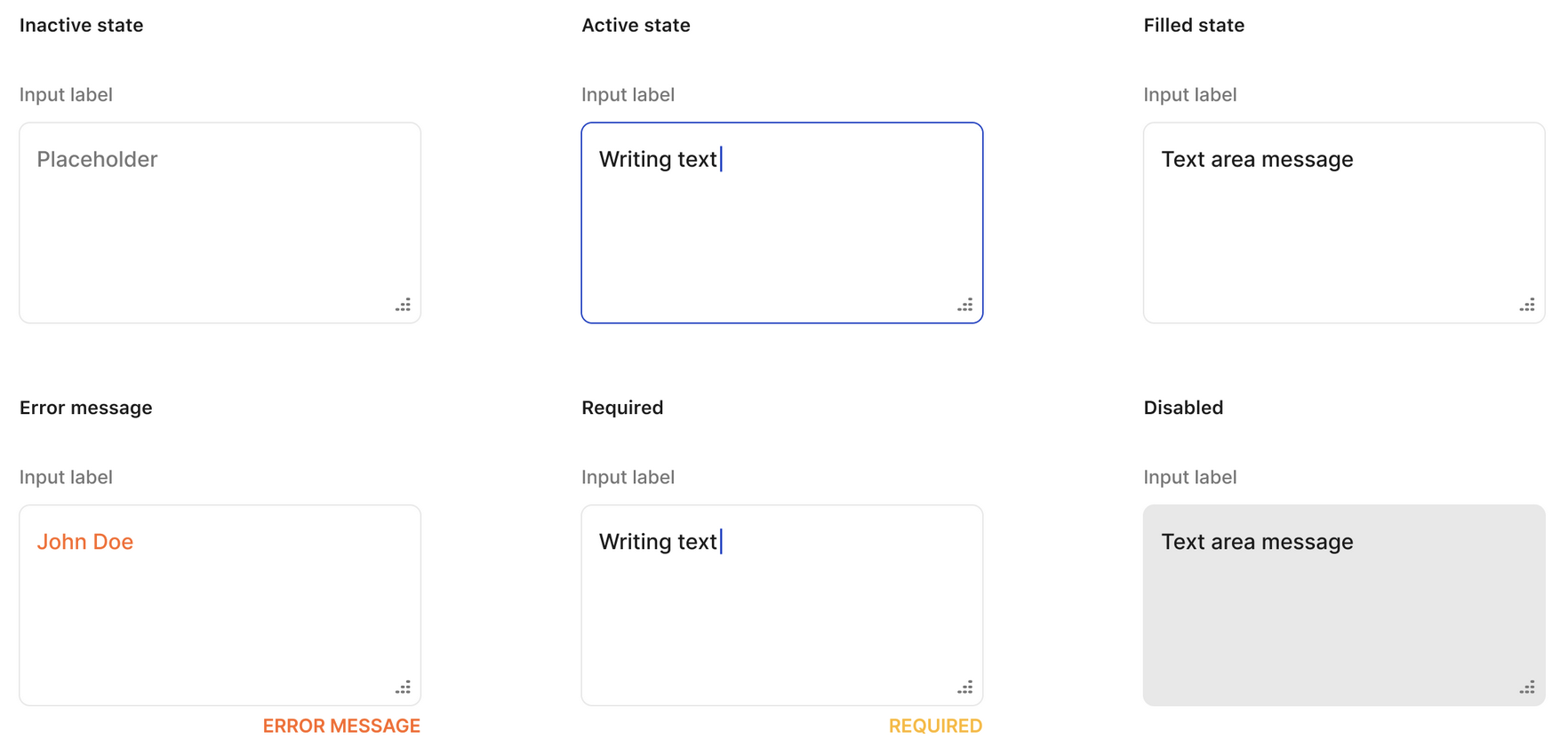
Data entry / Input
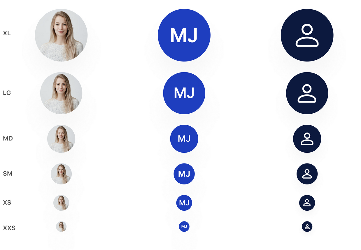
Data display / Avatar
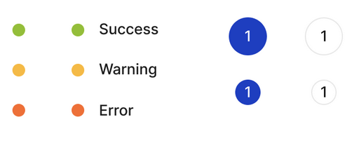
Data display / Badge
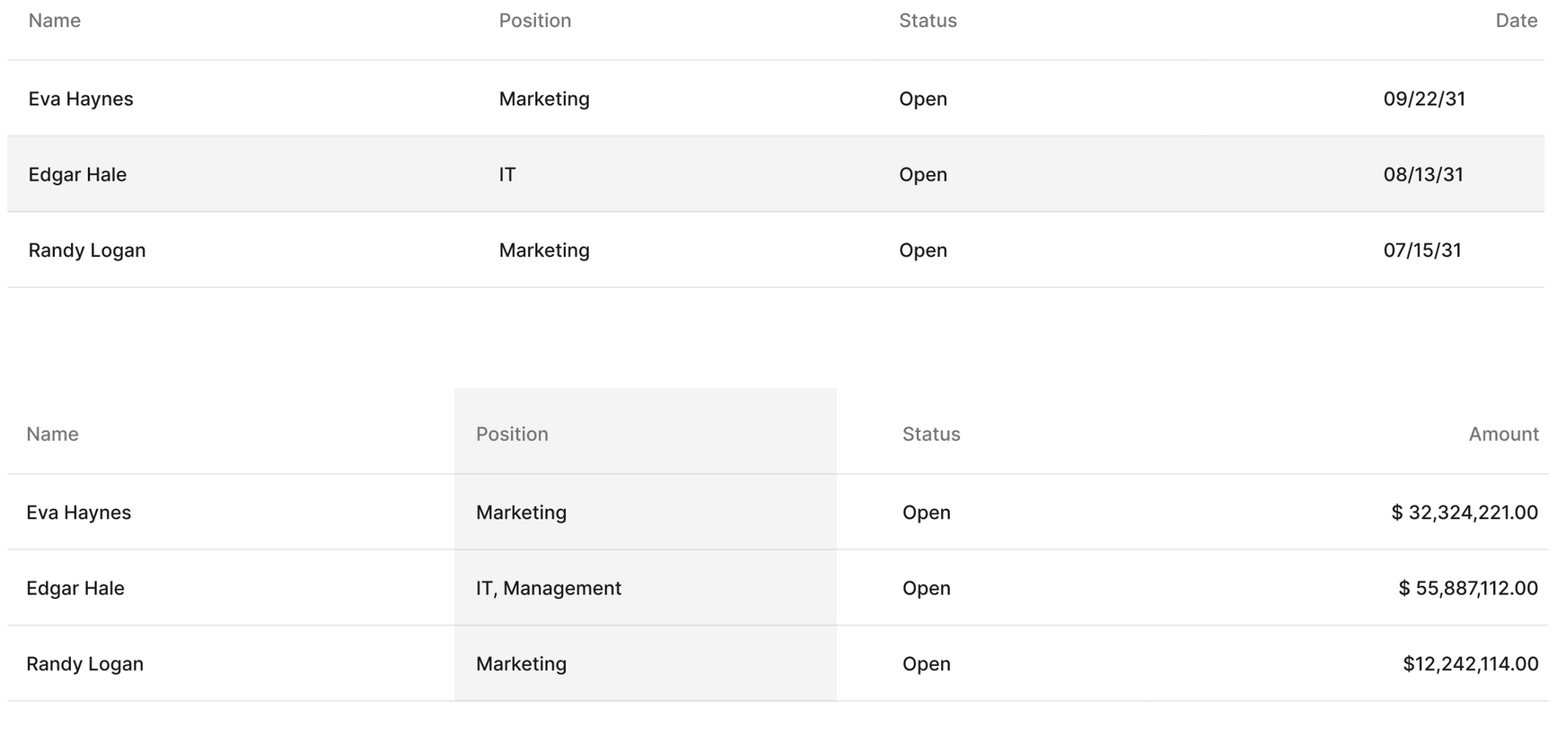
Data display / Table
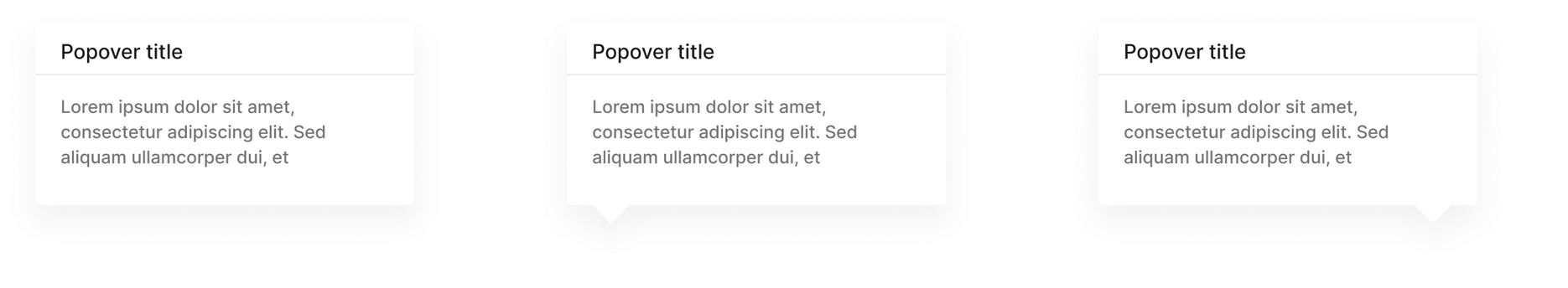
Data display / Popover
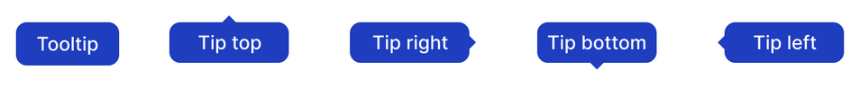
Data display / Tooltips
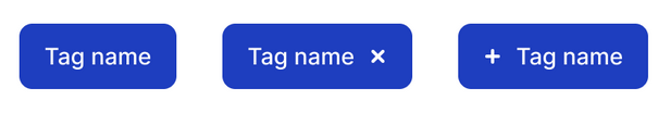
Data display / Tags
Data display / Cards
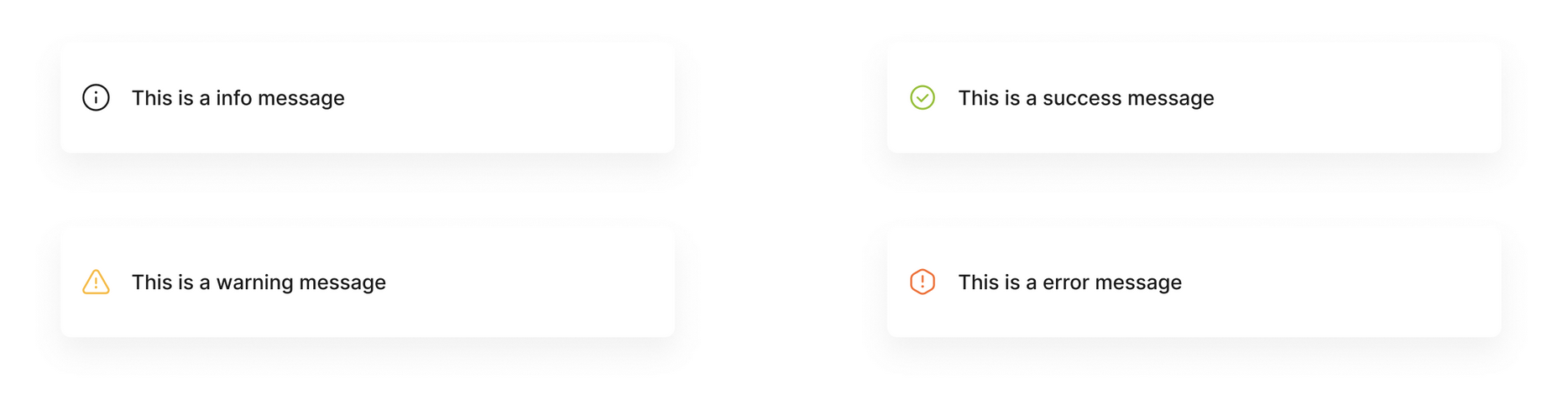
Feedback / Alert
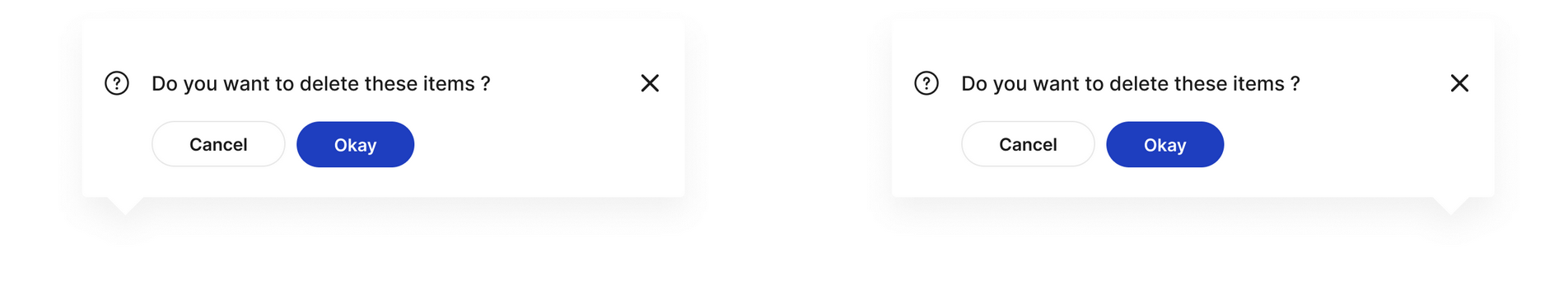
Feedback / Modal
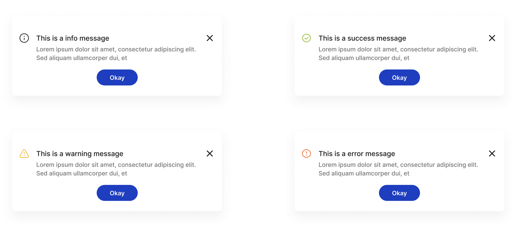
Feedback / Message
Feedback / Notification
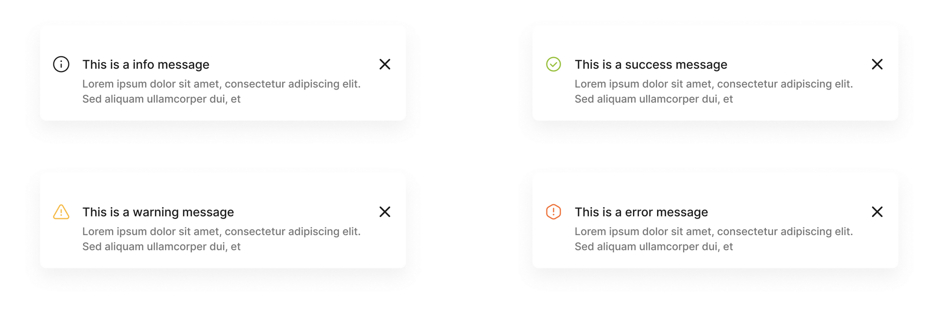
Feedback / Popconfirm
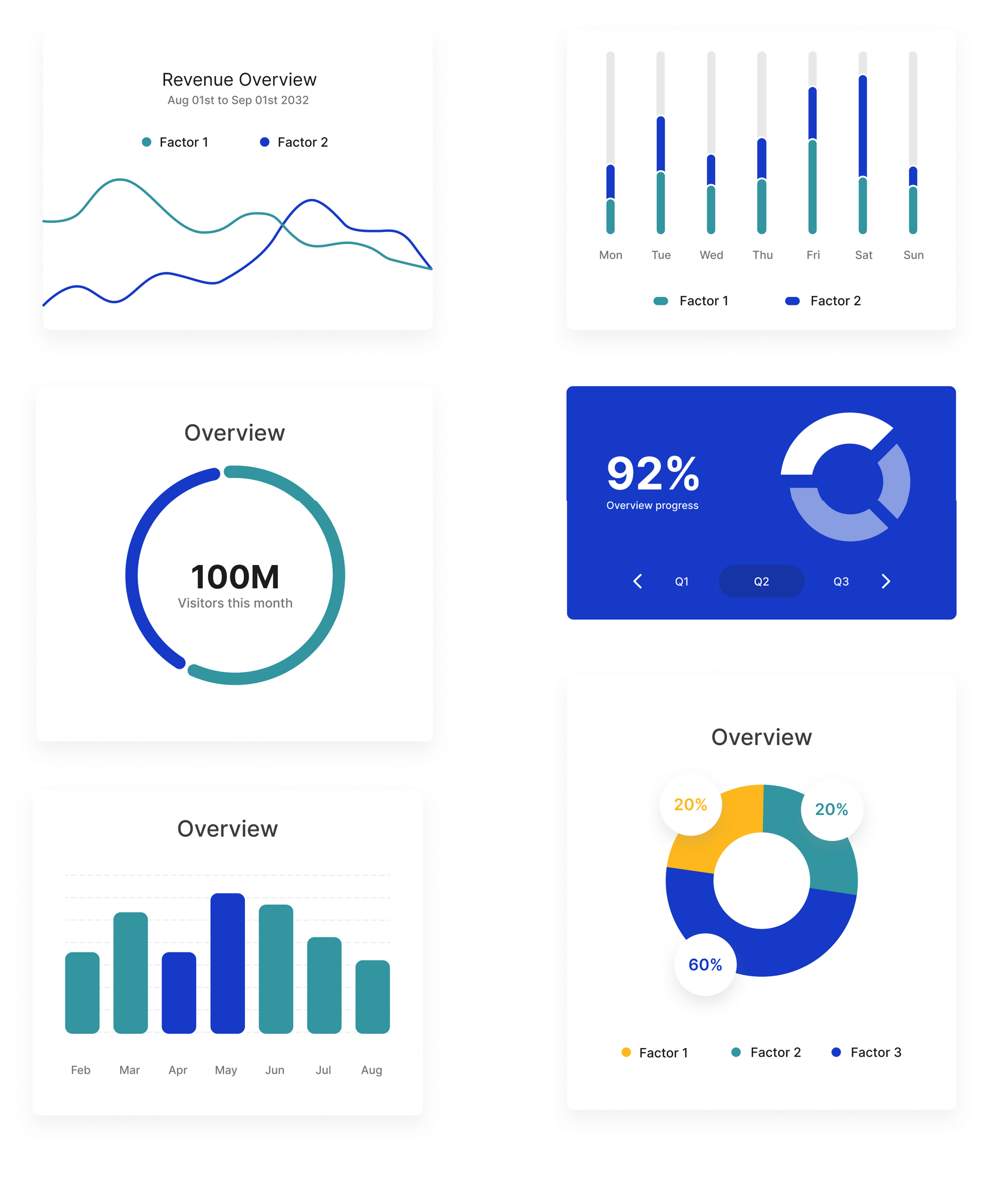
Feedback / Graphs
UI Patterns & Navigation
Ergonomy established through design principles following eye-tracking and heat maps using the F pattern for placing both global and secondary navigation and content, including input fields, tables and notifications.
Key takeaways
+ 33 (0) 6 62 81 69 54
penstar@email.com, Orgeval, 78630, France
© | 2025