CLIENT
Servier Pharmaceuticals
CONTRIBUTION
UX RESEARCH
UX STRATEGY
UI DESIGN
DESIGN SYSTEM
BRAND
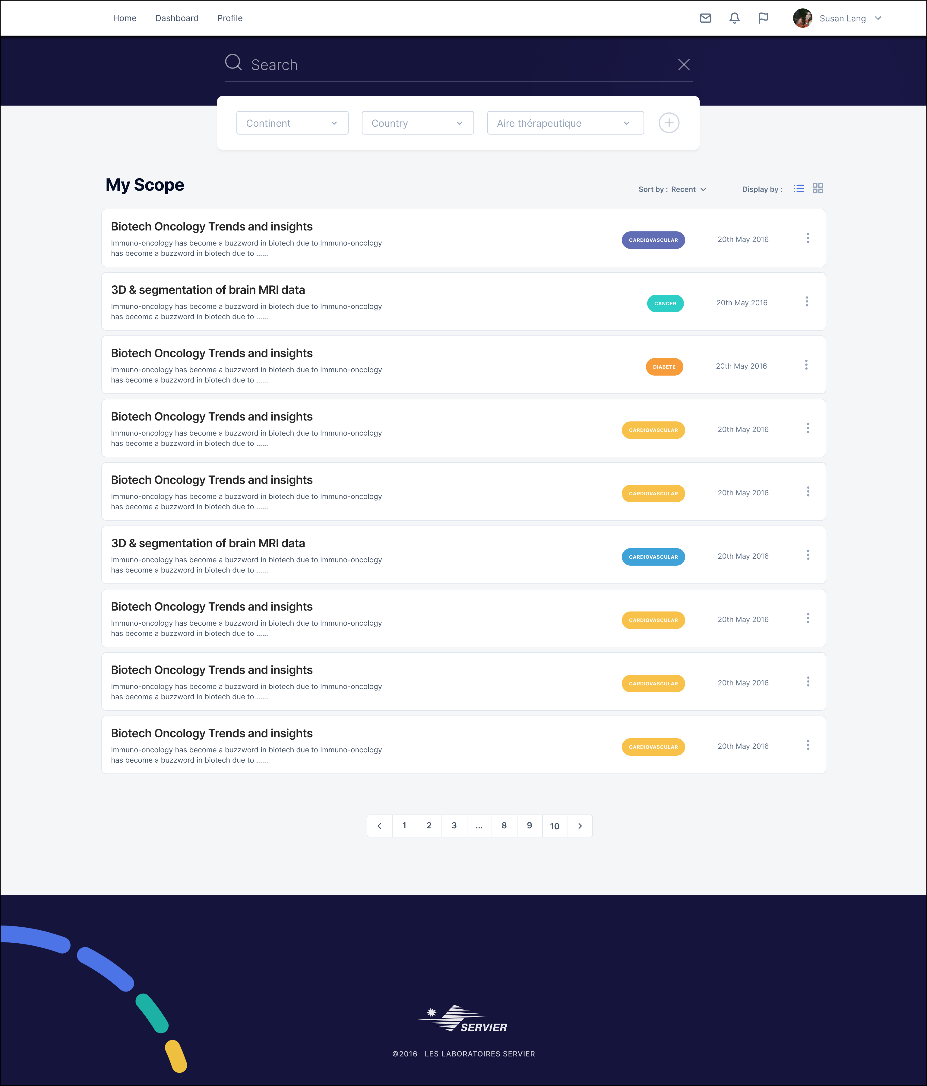
Designing an Optimized Search
The DSMM (Direction Stratégique Médicin Mondiale) at Servier Pharmaceuticals, present in over 150 countries worldwide, requested a secure Cloud-based platform to consolidate and share their strategic documents and medical reports worldwide.
The challenge we determined would be finding the right strategic documents and reports in a vast digital repository, as users often struggle with unclear filters, irrelevant results, and inefficient navigation. A truly effective search interface goes beyond a basic input field—it incorporates a range of features such as auto-suggestions, filters, and sorting options, ensuring the accuracy and relevance of results.
Through key stakeholder and user interviews and iterative prototyping, we developed a streamlined, user-centric search interface allowing professionals to locate the content they need and dynamic information streams to enhance discoverability on new documents and keep users coming back for more.
There were several other UX considerations, such as security access levels, user profile, and filters to ensure the relevant information surfaced, and a bonus was rating and communication with other users. For presentation purposes, we will remain focused on the search design and experience.
Our goal was to redesign the search experience by implementing intuitive filters and facets, improving relevance, speed, and usability.
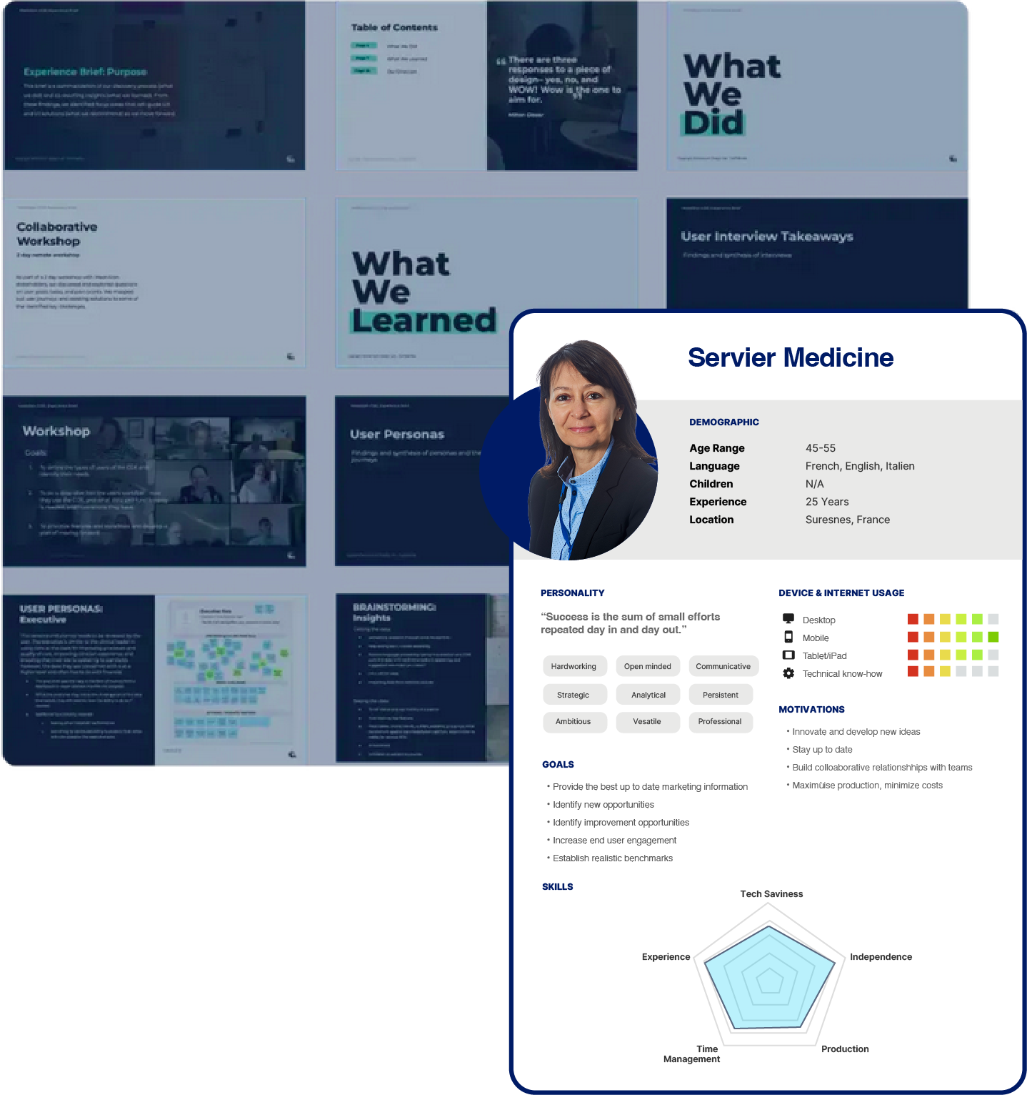
Identifying the key users
As this was an internally sponsored project, we kicked off with a briefing and several interviews with key stakeholders to listen and learn about their requirements. They would also be the end users, but as this was not just reserved for the C-suite, I hunted down other potential users to understand their expectations of such a platform. An interesting highlight was the ability to save searches and receive notifications on new document additions and links to external industry subscriptions.
Identifying a red route flow for the MVP
With the project team members, technical & business, it was important to identify the core user flow to start building out a MVP from there. This was done in two stages first stage identifying ideal flows and outcomes, secondly validation with the technical team.

Core User flow
Before formalizing everything through an information architecture diagram, I created a high-level (visual version) user flow with identified features described to facilitate discussions with the key stakeholders.
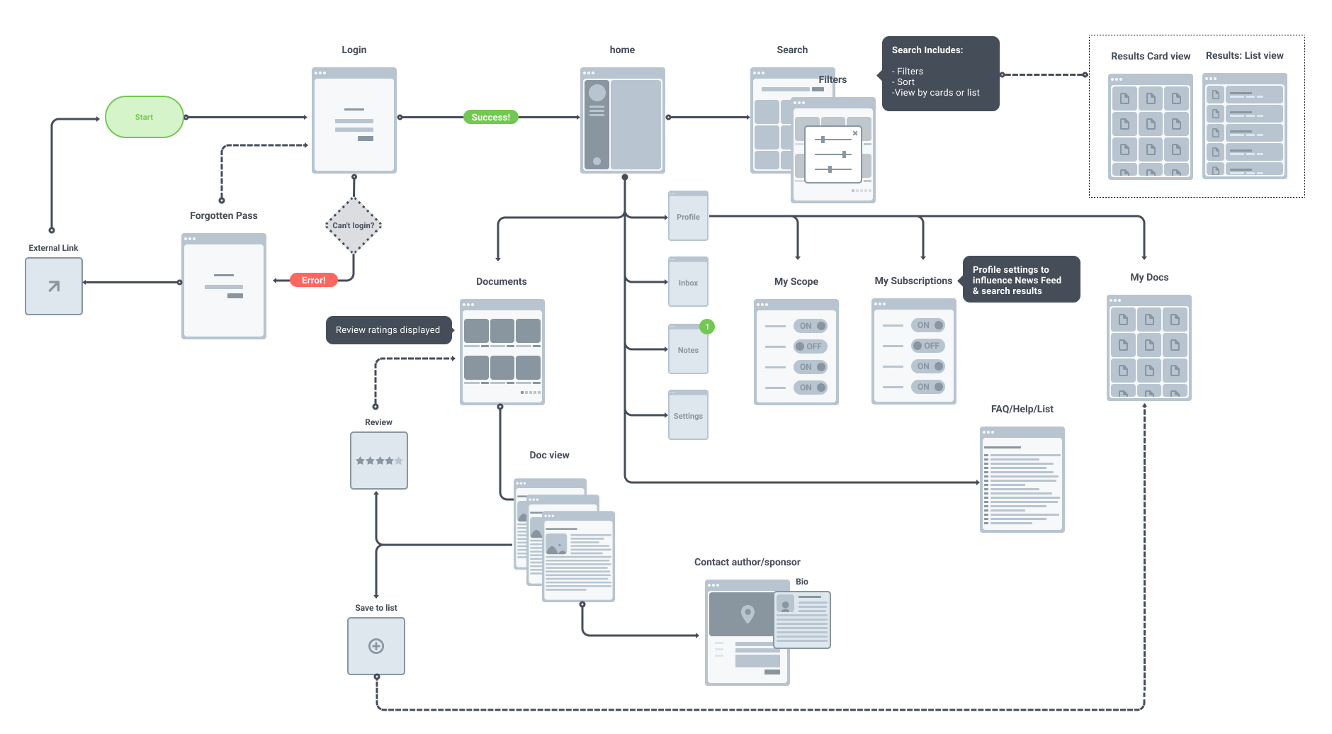
Key User flow - High level view on the functional requirements
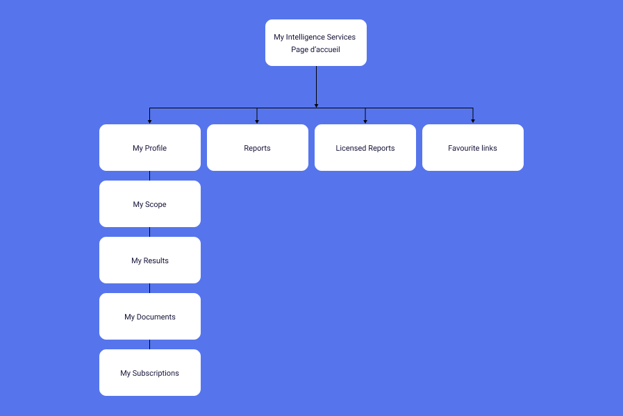
The information architecture
The information architecture was refined and deliberately simple for the version 1.0 of the platform development.
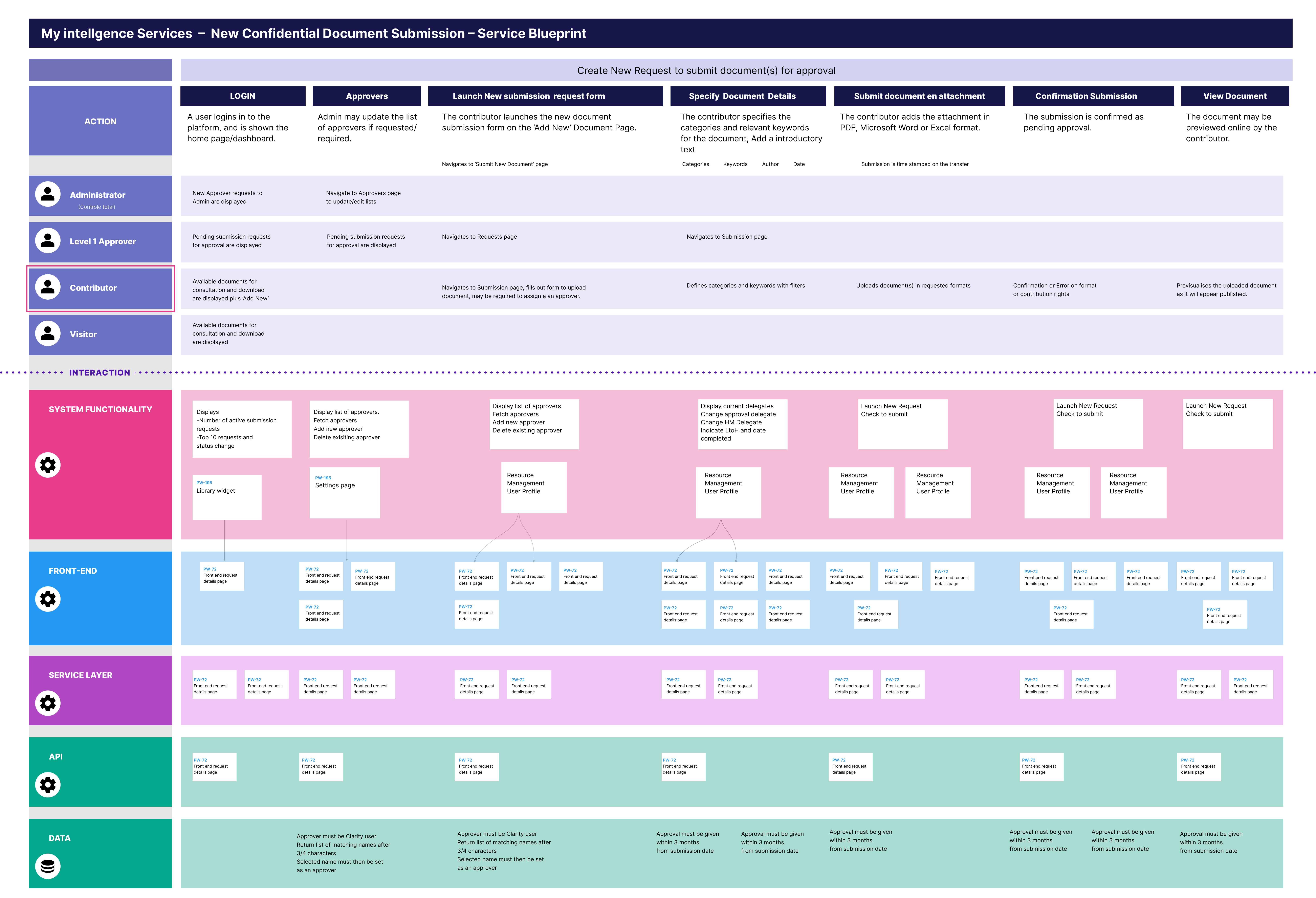
Service Blueprint
A service blueprint was created through conversations with the engineers to highlight the levels of user access for different. tasks or functions on the platform, in this case, a new document submission.....
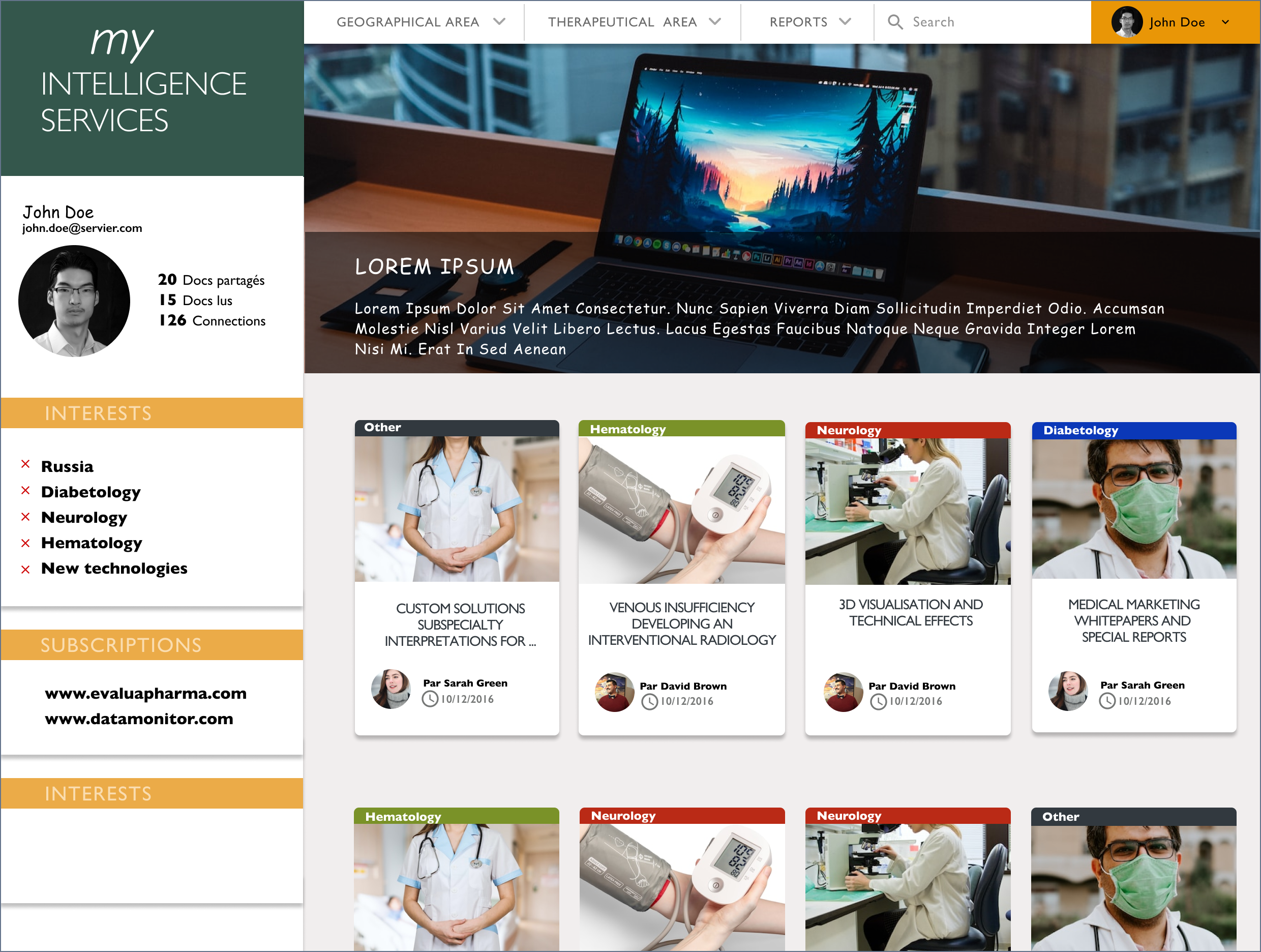
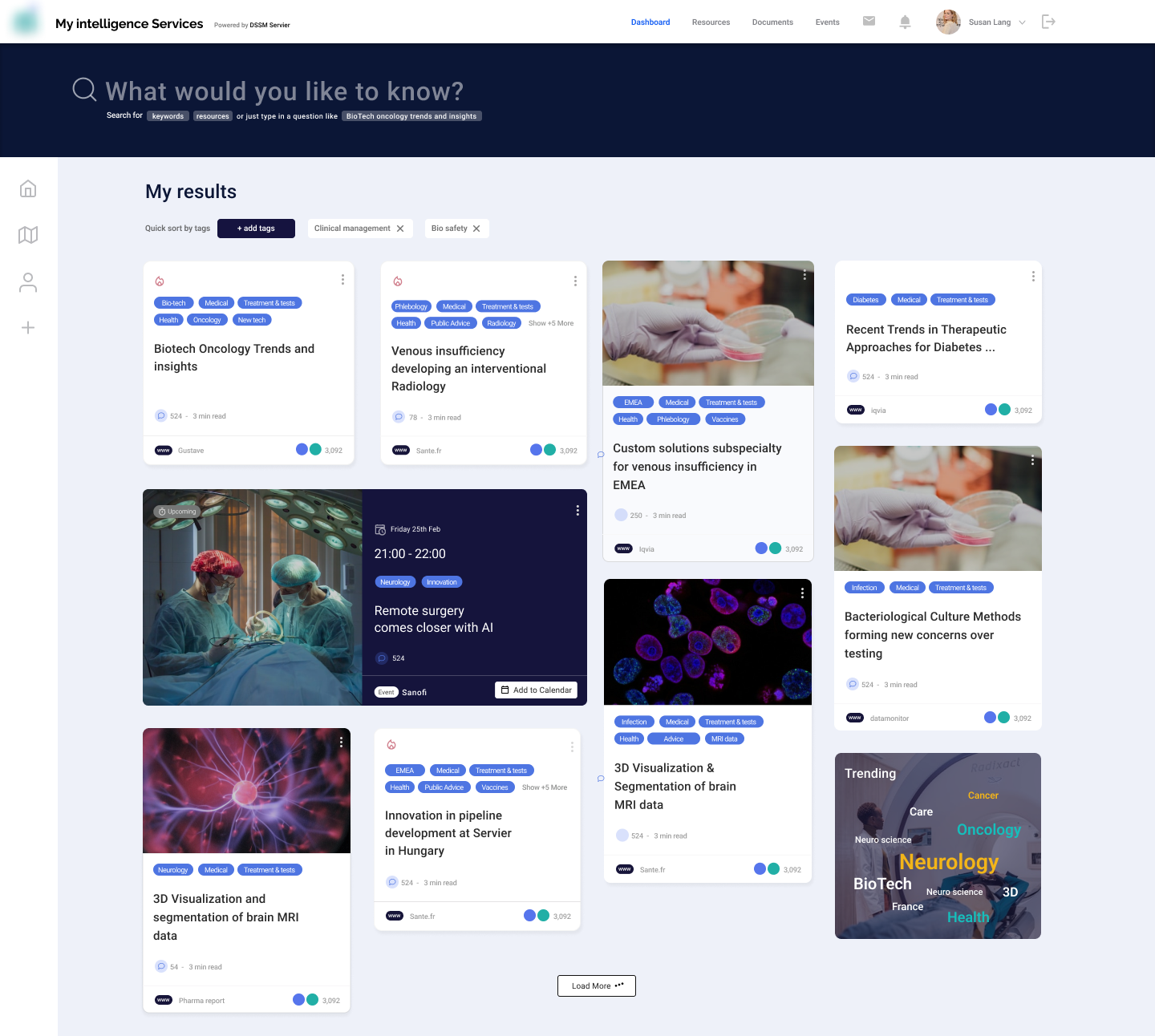
The existing design proposal
I was provided with an existing design as a point of departure, it enabled me to .... Using this as a base, I created a wireframe to concentrate on the functional UI and facilitate conversations with team members.
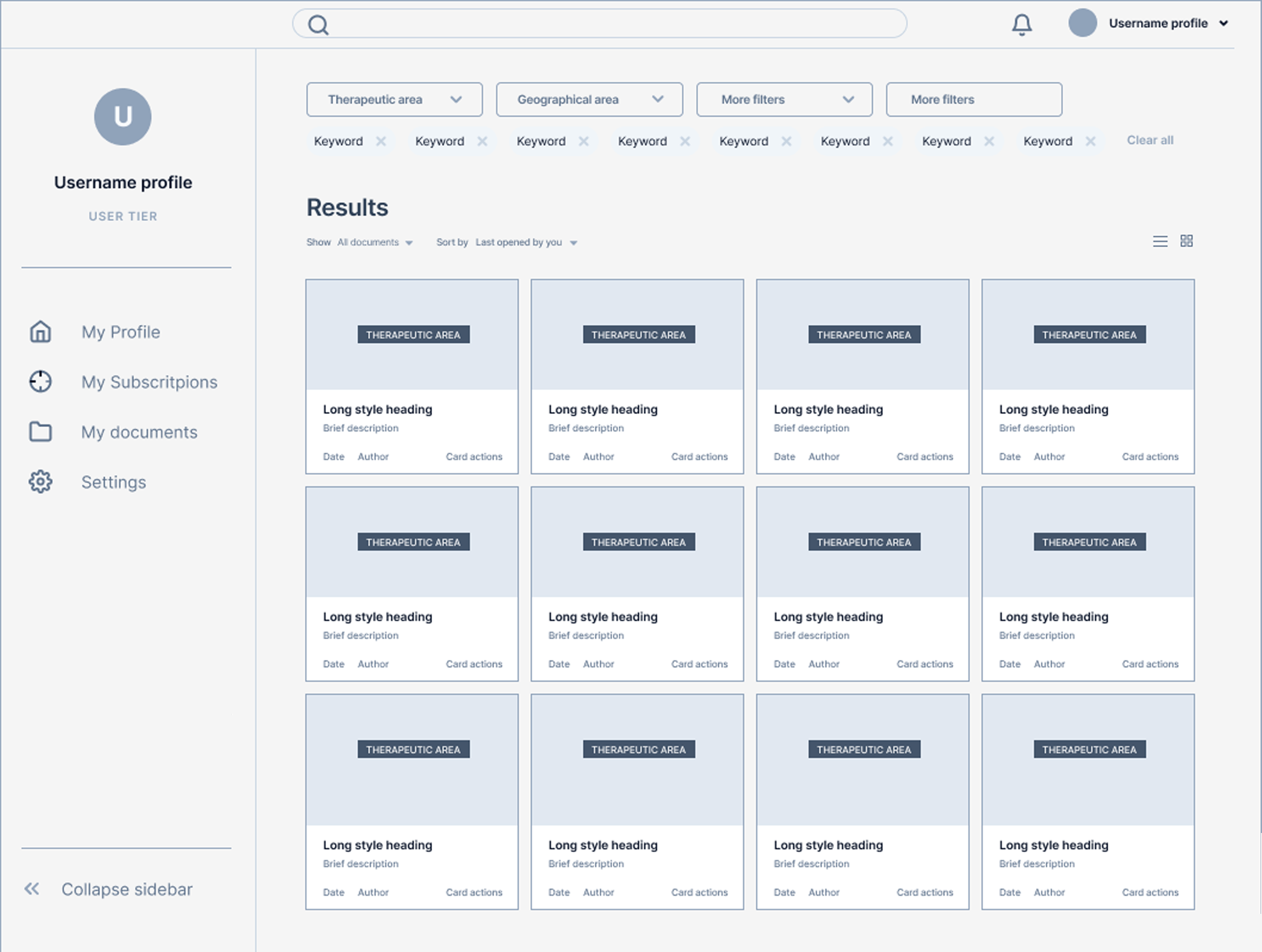
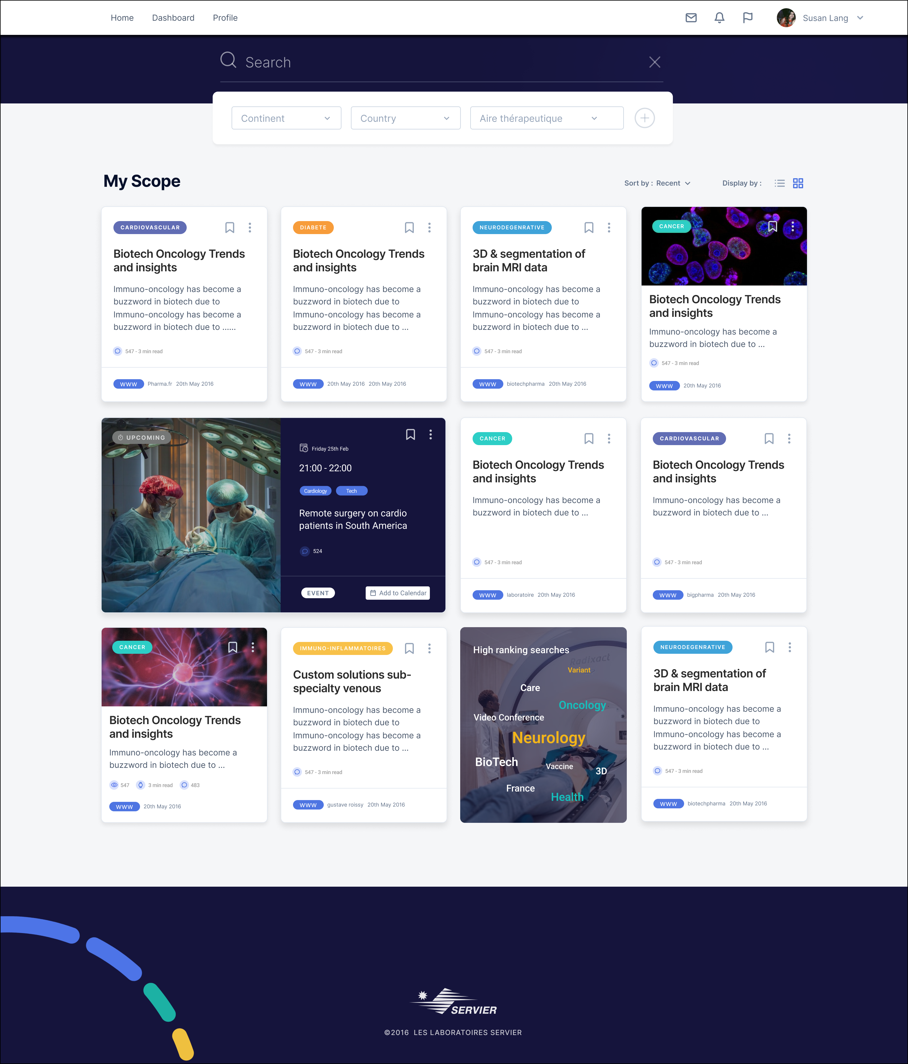
Low-fidelity Design
I was provided with an existing design as a point of departure, it enabled me to .... I created from this a wireframe to concentrate on the functional UI and facilitate conversations with team members.
Brand & Design System
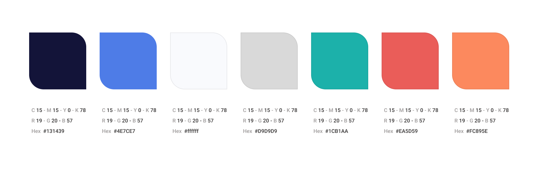
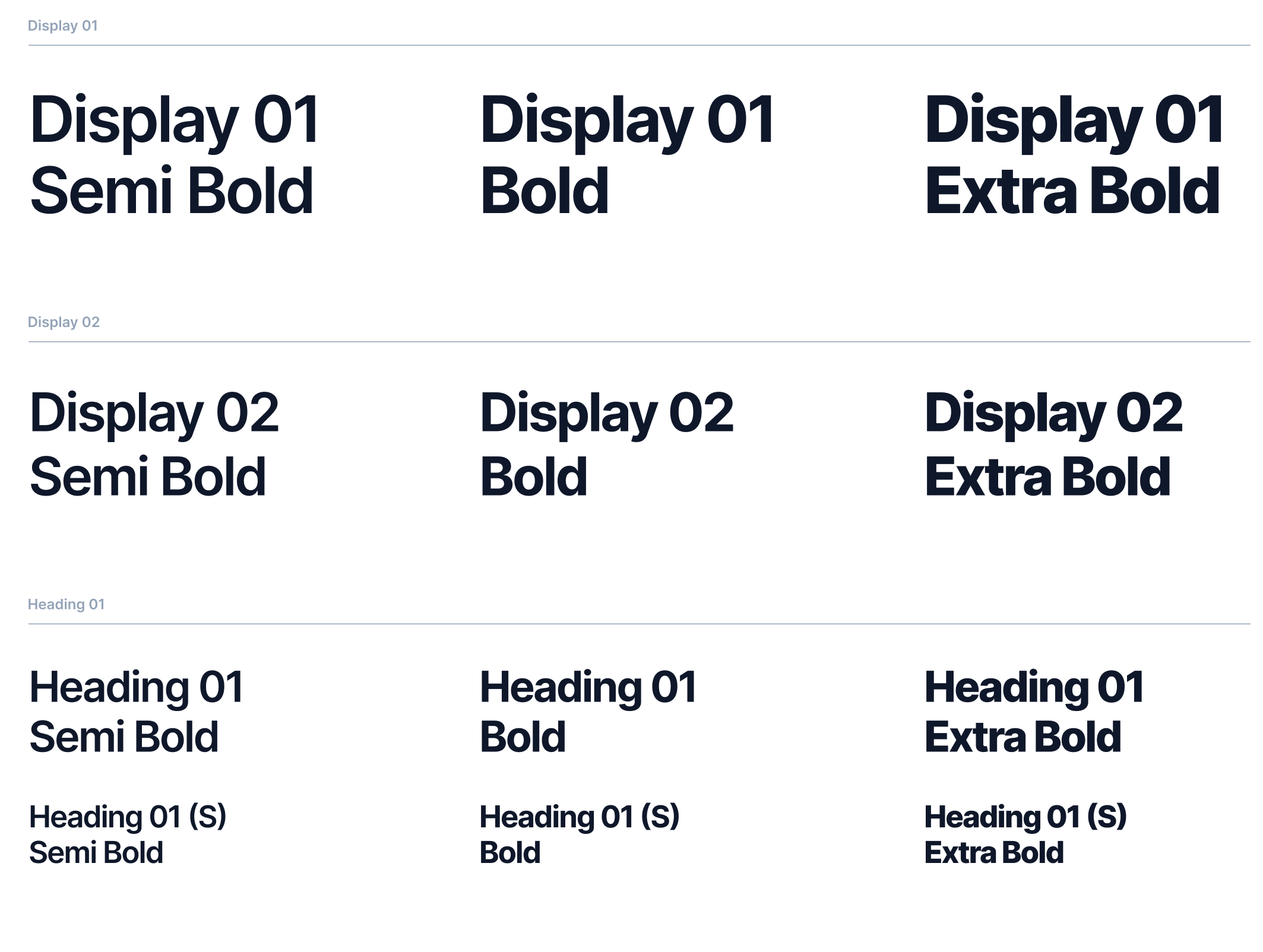
Brand & Design System
Key Takeaways