CLIENT
THE FOOD ADVENTURES
CONTRIBUTION
UX STRATEGY
UI DESIGN
DESIGN SYSTEM
BRAND
YEAR
2021
Private Chef, Online Ordering: A Seamless Experience for Repeat Customers
A former Formula One chef installed in the South of France, contacted me to develop and scale her online ordering experience. The current mobile ordering experience was falling short. Ordering was time-intensive, menu navigation was confusing and a reliance on third-party tech limited her brand’s digital expression and ability to execute critical business objectives.
01
CURRENT EXPERIENCE AUDIT
Auditing the current experience
Our main goals were to increase conversion and digital engagement from new customers and increase the frequency & ease of ordering from existing customers. I got very familiar with the current experience and key usability issues to address.

02
ASKING THE RIGHT QUESTIONS
Research
Prior to our official client kickoff, I went through client-provided research materials, read up on industry trends and audited best-in-class competitors. I learned about e-commerce mental models and what drives repeat ordering and customer loyalty. I worked closely with product to understand and quantify where customers were getting stuck and/or bouncing, and collaborated with engineering to understand any technological constraints. I facilitated a series of discovery workshops with key stakeholders, listened in on stakeholder interviews and conducted a few customer interviews myself with new, average and power customers.
6
STAKEHOLDERS INTERVIEWS
7
CUSTOMER INTERVIEWS
3
WORKSHOPS FACILITATED
9
COMPETITORS AUDITED


03
ANALYSIS
Insights & opportunities
After multiple client workshops and alignment sessions, it became clear where we needed to focus our attenton heading into design.
"Unclear how to edit an ingredient (need to tap to reveal 2x and trash icons"
“I’m getting a bit bored of the Tinga bowl, but it’s safe and right there so I’ll go for it again.”
"Want the content to inspire the customer, which will make them feel good about ordering. When ordering is seamless, frictionless, and that holistic journey creates a loyal customer.”
04
DESIGN DIRECTION
Visual exploration
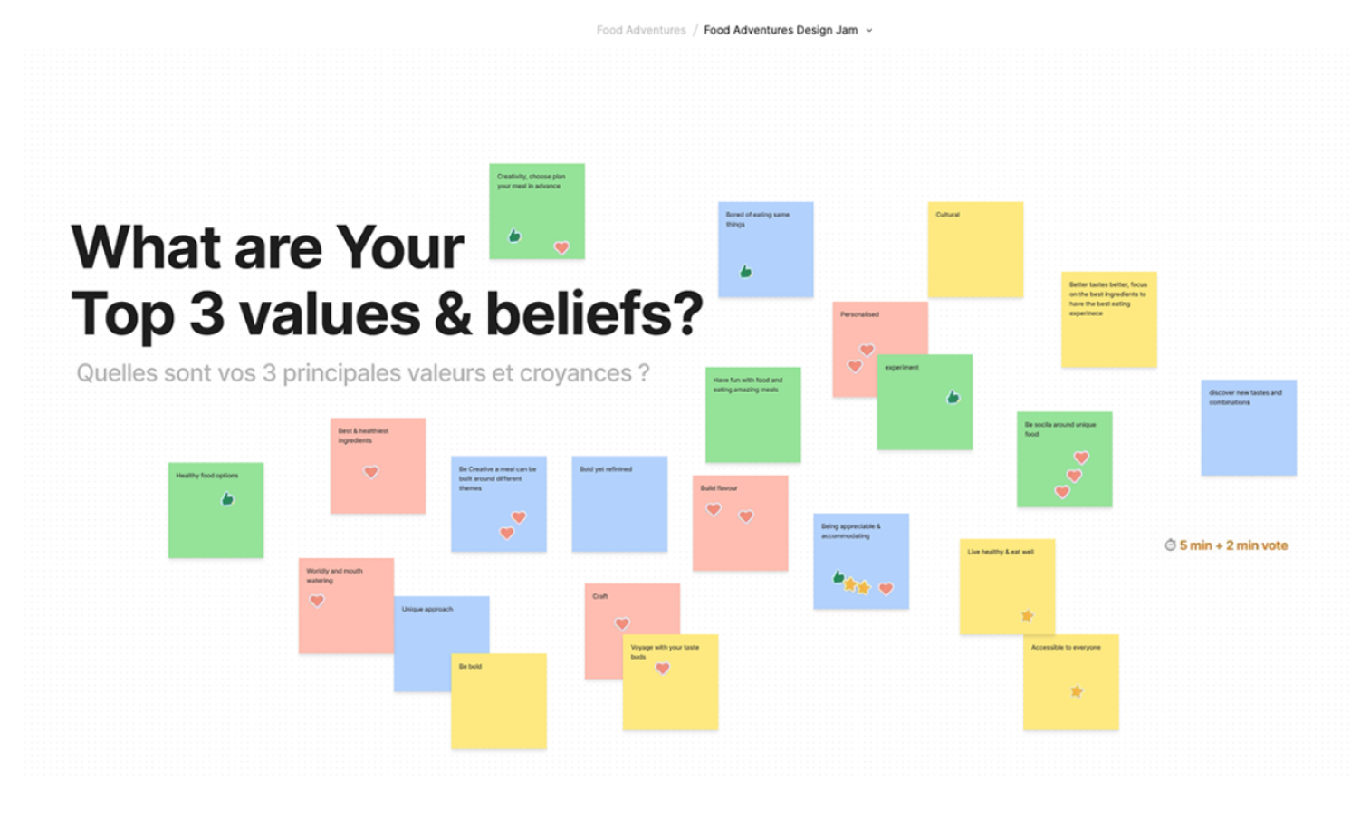
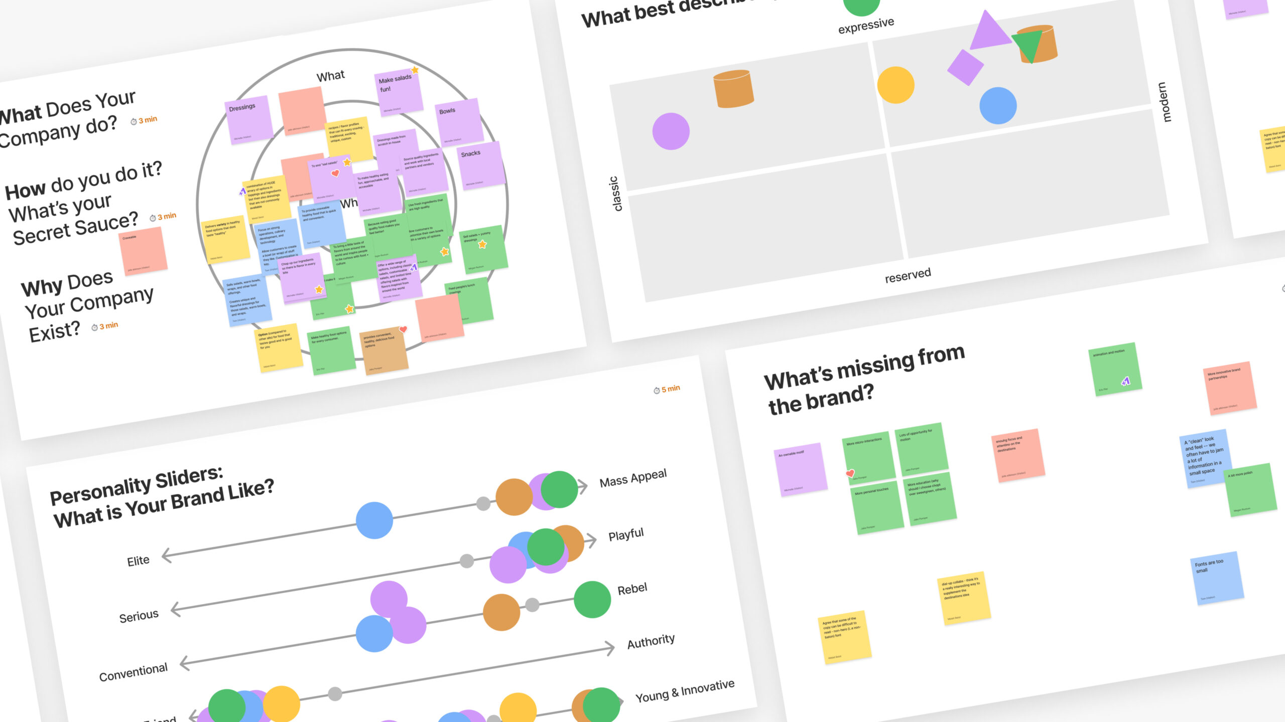
The scope was not to do a full brand redesign, the client was open to visual direction explorations specifically for the app. I co-facilitated workshops with the client to understand who The Food Adventures is as a brand, what is missing, and gauge the appetite for change.
“It's got to be awesome, memorable, and unique ”
Inga Brown


05
PICKING A DIRECTION
Where we landed
After a few rounds of feedback, we landed on a direction that felt fun and playful, yet modern and refined. A neue-brutalist style with hand-drawn elements and bold, saturated colors.
06
INFORMATION ARCHITECTURE
Information Architecture & Navigation
A high-level view, structured the features, functionalities, and content, ensuring nothing was missed. I used this document as a reference only, as it required several in-depth discussions with the client to validate, the next steps were easier to illustrate and identify edge cases.
08
ORDERING MADE EASY
Interactions
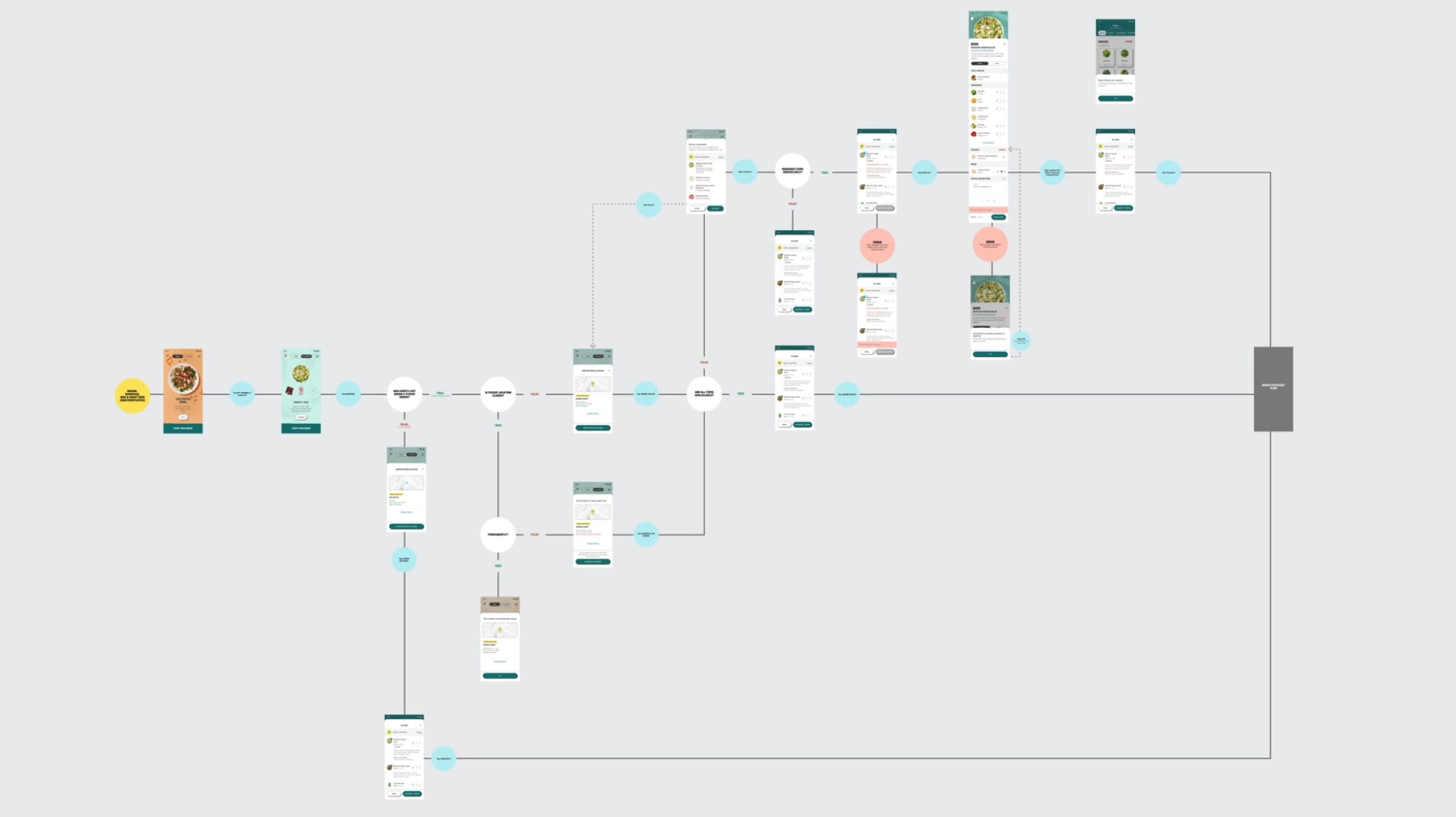
Over the years, I've been developing a flowchart system to use for scenarios with many divergent paths. It was a big hit on this project with the client since it helped them make sense of complicated business logic and uncover new edge cases. Our developers actually preferred it to interactive prototypes since it closely mirrors their thought process when building.
KPI CONVERSION
A dynamic homepage
The Home feed is likely a customer's first digital impression. Its main goal is communication, brand expression, and teasing new menu items. A multi-directional swiping paradigm allows for easy one-handed use and quick access to account details and the QR code for in-person payment.
KPI
Improved speed to checkout
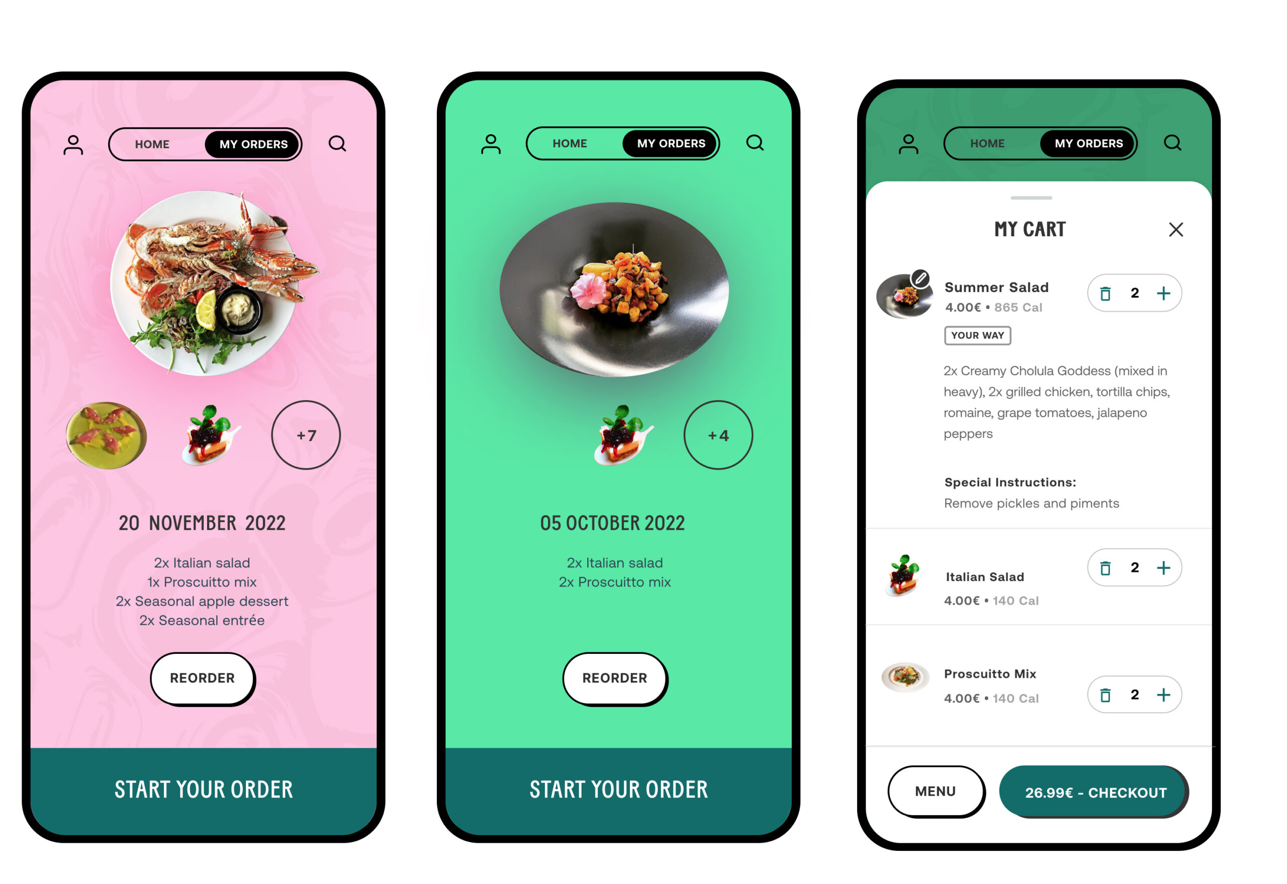
Effortless reordering
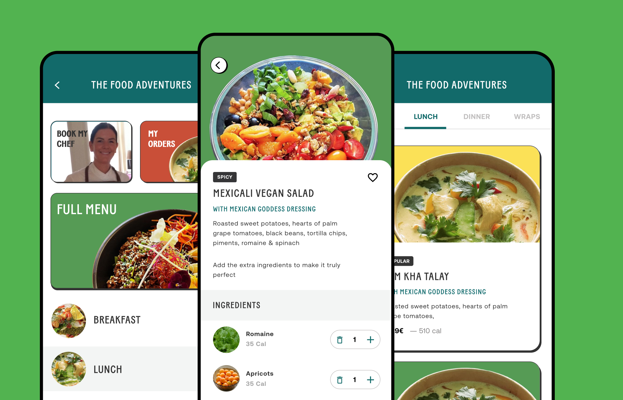
Out of all the features I worked on, reordering went through the most iteration. Ultimately, segmenting the home feed satisfied the needs of all key stakeholders, without UI elements competing for precious screen real estate. In a few taps, customers can add entire past orders directly to cart without even browsing the menu; incredibly useful for those who frequently order the same thing. Apple and Google Pay only made things easier.
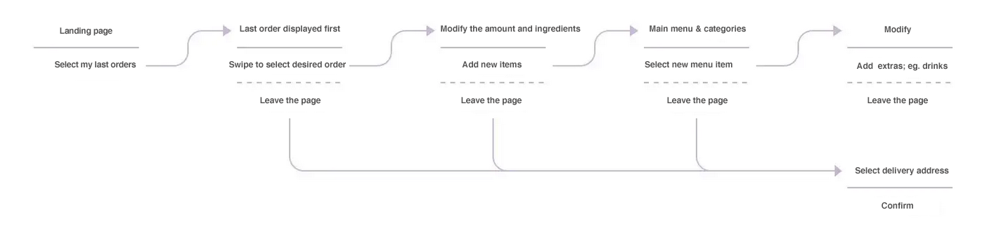
I establish key user flows through a short-hand form, in preparation for the next step where I illustrate and map them out in more detail for the client and development teams. Below is a re-order flow where we concentrated on identifying and then developing this first.
“I always order the same thing. I find big menus overwhelming, so when I find something I like, I just keep reordering it.”
—Ana, power user
KPI
Decreased Abandonment
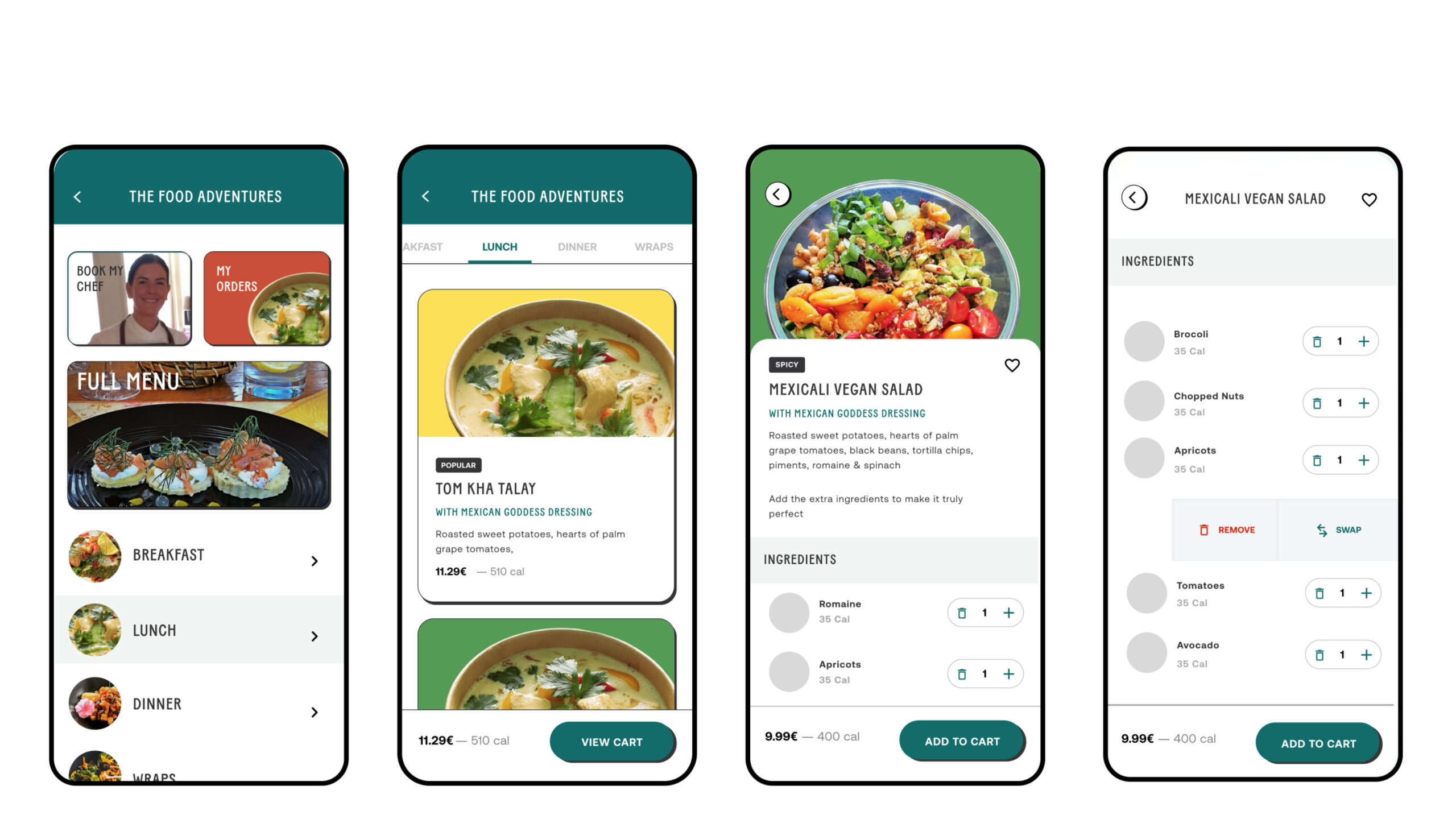
Improved menu navigation
A modular category landing page designed to improve discoverability of new menu items, and give each localized menu the flexibility to upsell certain menu items. On the full menu, I stacked menu items (versus horizontal scroll) and relied on anchor links for quickly jumping to the different menu categories.
KPI
Increased Average Order value
Your Way
Over 60% of the customers modify at least one ingredient. This inspired the swap functionality; when customers tap to delete an item, they can either confirm the deletion or they can swap with multiple ingredients. This one-to-many swapping feature has led to increases in average order value and more satisfied customers.
Outcomes
65%
INCREASE IN REORDERS
85%
REDUCTION IN SUPPORT REQUESTS
+ 33 (0) 6 62 81 69 54
penstar@email.com, Orgeval, 78630, France
© | 2025